
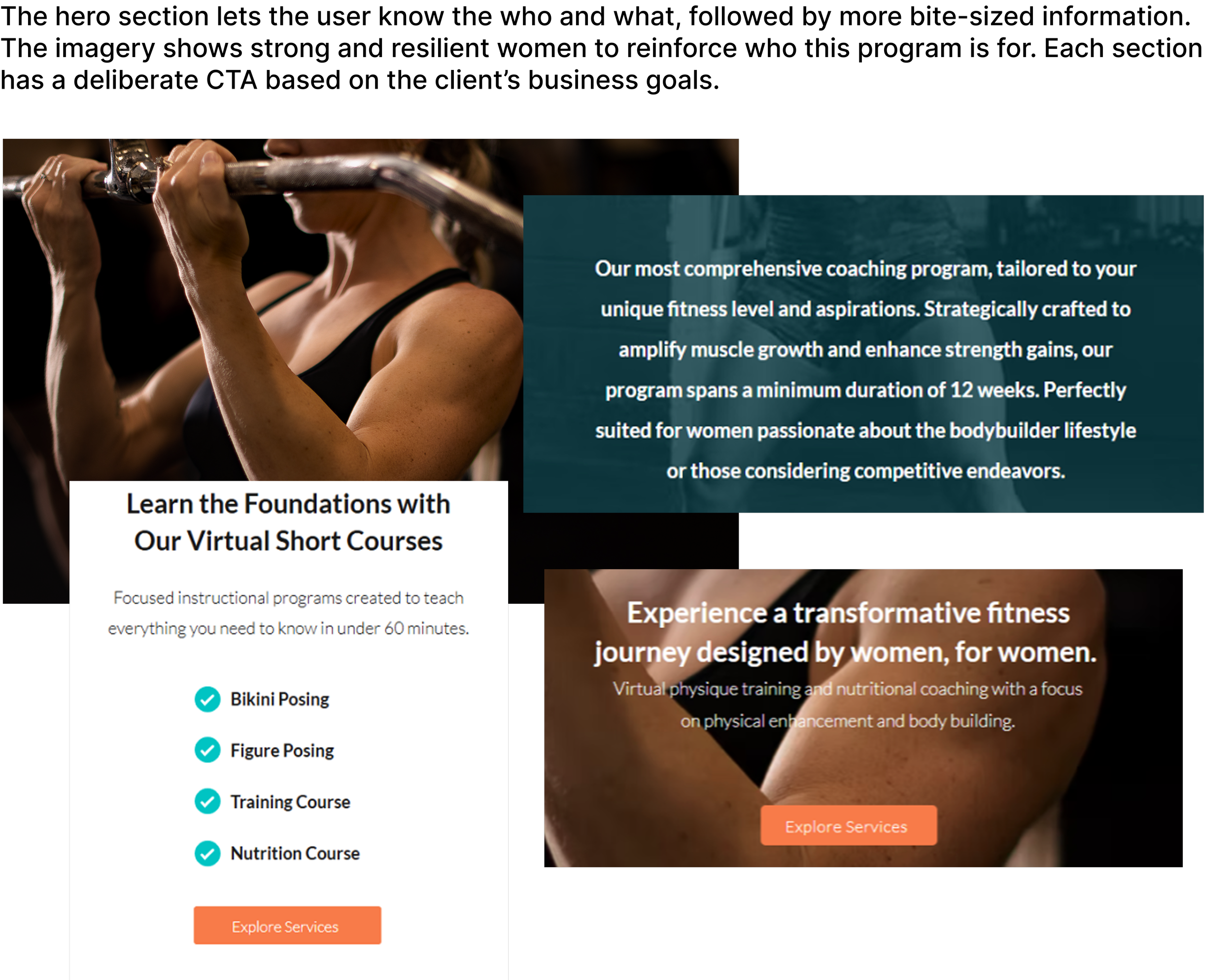
As the UX/UI Designer, Researcher, Business Strategy Consultant, Wix Website Designer, and Content Writer, I led a full rebrand and website overhaul for Team Thrive Athletics—competitive bodybuilding and holistic physique coaches—clarifying their services, showcasing their personalized training, nutrition, and virtual coaching app, and strengthening their position in a crowded fitness market.Stakeholders: Team Thrive AthleticsRole: UX/UI Design & Research, Business Advisor/Strategy Consultant, Wix Website Designer, Content WriterProject length + completion: 1 year, 2024Methods used: Contextual interviews, competitive analysis, empathy map, affinity map, personas, interviews, UX audit, sketchesTeam Thrive Athletics Responsive Website & Redesign
Transforming a powerhouse coaching brand into a clear, modern, and conversion-driven digital experience for women redefining their strength.
PROJECT OVERVIEW
Problem
TTA, a small business initially relying on word of mouth, found their website lacking clear information about their identity, services, and uniqueness. Specifically, they wanted to make it clear that they offer strength training along with coaching for competitive bodybuilders. TTA realized they were fielding a lot of questions from new users (potential clients) who didn’t quite understand who they are or what they did. It became evident that their outdated website needed a refresh to better serve and inform new clients.
CLIENT DISCOVERY
At the start of the discovery phase I met with the stakeholders. They felt that their website struggled to:
Provide a clear vision statement.
Accurately represent TTA’s identify.
Differentiate offerings so they are easily understandable.
“The people inside our bubble understand what we do. [Our] website is just a formality…but our business is continually growing. Now [our reach] is wider; [new clients] don’t know us, they’re visiting our website, and that is where the disconnect is occurring.” -Coach Emily
Stakeholder feedback established the core problem areas, which were explored through competitive analysis and validated through a site audit and contextual interviews to align business goals with real user needs.
Research + Insights
Qualitative Research
GOALS
How do users respond to TTA’s current website, i.e., think, feel, say & do?
What pain points do they experience while visiting TTA’s current website?
What information do users need to confidently choose a fitness program/coach?
What design elements install trust/confidence in users?
To build a website that actually works for its audience, I needed to reveal how users think, feel, and behave on TTA’s site—and pinpoint the gaps keeping them from choosing a program with confidence. I focused on uncovering the following information through my research.
COMPETITOR ANALYSIS
I also analyzed two competitors (shared with me by TTA), Team LocoFIT & 10-week Tone and Shed to better understand what makes TTA unique compared to other training programs.


FINDINGS
Patterns around trust-building, onboarding clarity, and engagement revealed in the competitive analysis guided the transition into contextual interviews to validate user needs and behaviors, and into a site audit to assess how effectively the current experience supports conversion and retention.
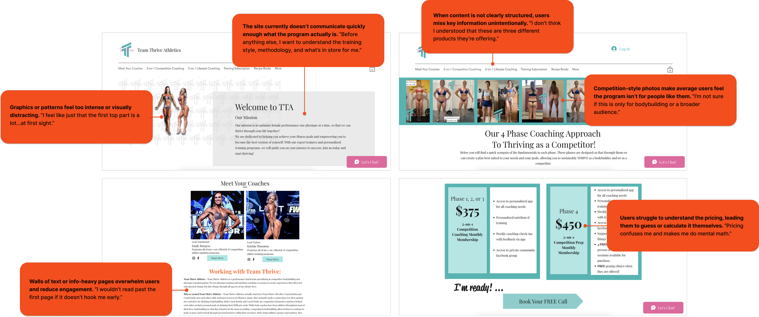
Screen grabs from the stakeholders original website: (top to bottom) hero section, services page, pricing, about the coaches.
I learned that users need clear, digestible information up front to stay engaged. Visuals are equally important indicator of the style and type of services to expect. Otherwise, the business doesn’t seem credible and the user is discouraged from learning if the product is right for them.
CONTEXTUAL INTERVIEWS + WEBSITE AUDIT
I interviewed women between the ages of 29 - 55 interested in fitness and asked them to review the current website. The interviews revealed that the business’ products (personal training/coaching) were unclear to users including their methodology, format, location, and pricing. Users’ found the website's visuals confusing and unappealing and they couldn’t find necessary information, which discouraged them from engaging further or understanding if TTA’s product is right for them.
Interview Findings
With feedback from the website audit interviews, I created an affinity map and broke out the users’ needs, paint points, and wants.
Pain Points
Overwhelming & confusing, website design.
Intimidating imagery.
Language & visuals geared toward competitive bodybuilding.
Unclear services, cost, location, & methods.
Wants
Know about the coaches.
To be part of a community.
See the coaches in action.
Needs
Concise breakdown of services, methodologies, pricing, & location.
Confidence in coach qualifications & ability to meet needs
Clean, simple, easy to use interface.
“The website is not pulling me in to think, ‘oh man, this chick’s going to be a gnarly coach.’”
Empathy Map

Based on the responses during the UX audit, it became clear that selecting a fitness program is deeply personal and users want to feel connected with their trainer. I chose to delve deeper into my users emotions and behaviors with an empathy map.
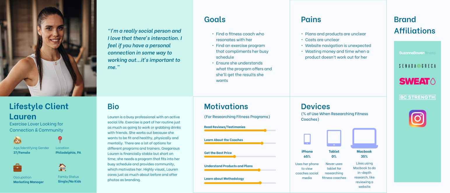
Persona
I applied my findings from the user interviews and the empathy map for the persona. Users won’t commit if they don’t understand what they’re signing up for. Confusing pricing and unclear services left them unsure of what was being offered. Finally, users want a supportive coach they can trust, with transparent details and clear qualifications to feel confident moving forward.
Ideation + Wireframes
Refined Problem Statement
The business’ products (personal training/coaching) are unclear including their methodology, format, location, and pricing. The website's visuals are confusing and unappealing to users, and they don’t know where to find necessary information, which discourages them from engaging further or understanding if TTA’s product is right for them. Based on these takeaways from user interviews and the competitive analysis, I asked “How might we display critical information so users understand the businesses purpose, goals, features, and unique value?
User Flow
Competition Coaching Application
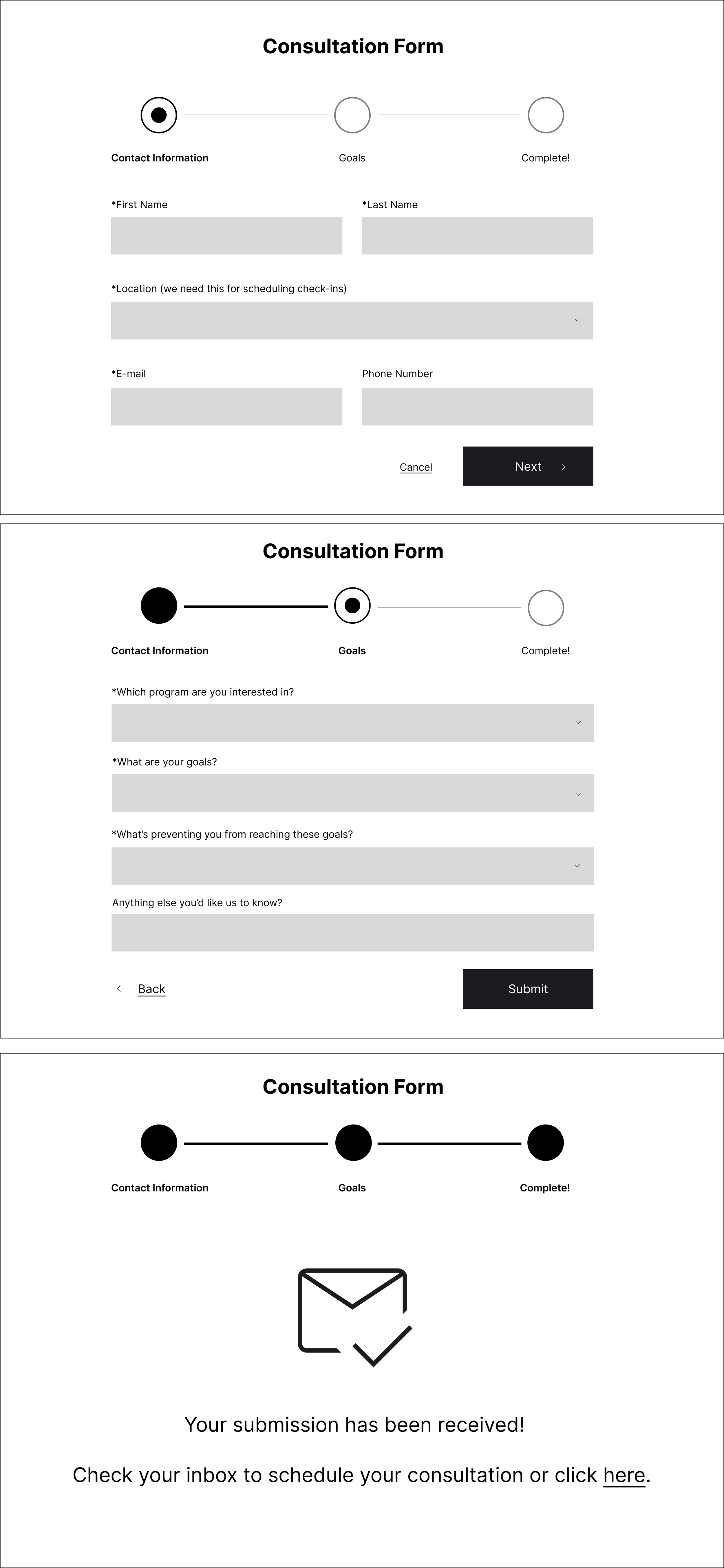
The stakeholders decided to no longer include pricing up front. This would change how a user gets information and ultimately signs up for training. TTA’s Competition Coaching is their main service product, however, users can’t just sign up for the program. Instead, the user has to complete a long application with 30+ questions and then wait for the coaches to follow up to schedule a consultation meeting.
The long application is discouraging for users who just want information, and having the coaches reach out at a later time creates additional barriers to complete the user’s goal of signing-up for the course. Users may lose interest by then, and the stakeholders would miss out on a paying client.
“That’s a pretty long application. Is there a way to learn more before jumping in?”
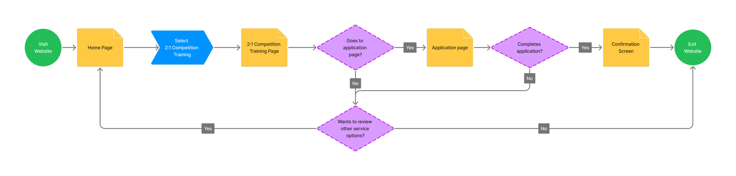
Original user flow for users to complete an application form. The form was lengthy and discouraged users who just wanted to get a bit more information.
Revised User Flow
Based on user feedback, I worked with the stakeholders to update their sign-up process.
Shorten Form: Reduced form from 30+ questions to 5 questions.
Prevents cognitive overload.
Form Completion -> Scheduling Consultation: The user can schedule a meeting time right after submitting the form.
Reduces steps for user to set up meeting and prevents them from losing interest.
Confirmation Page + Email: User receives a confirmation page after submitting form & selecting meeting time, and a follow up email with the same details.
The user is reassured that their goal was completed successfully.
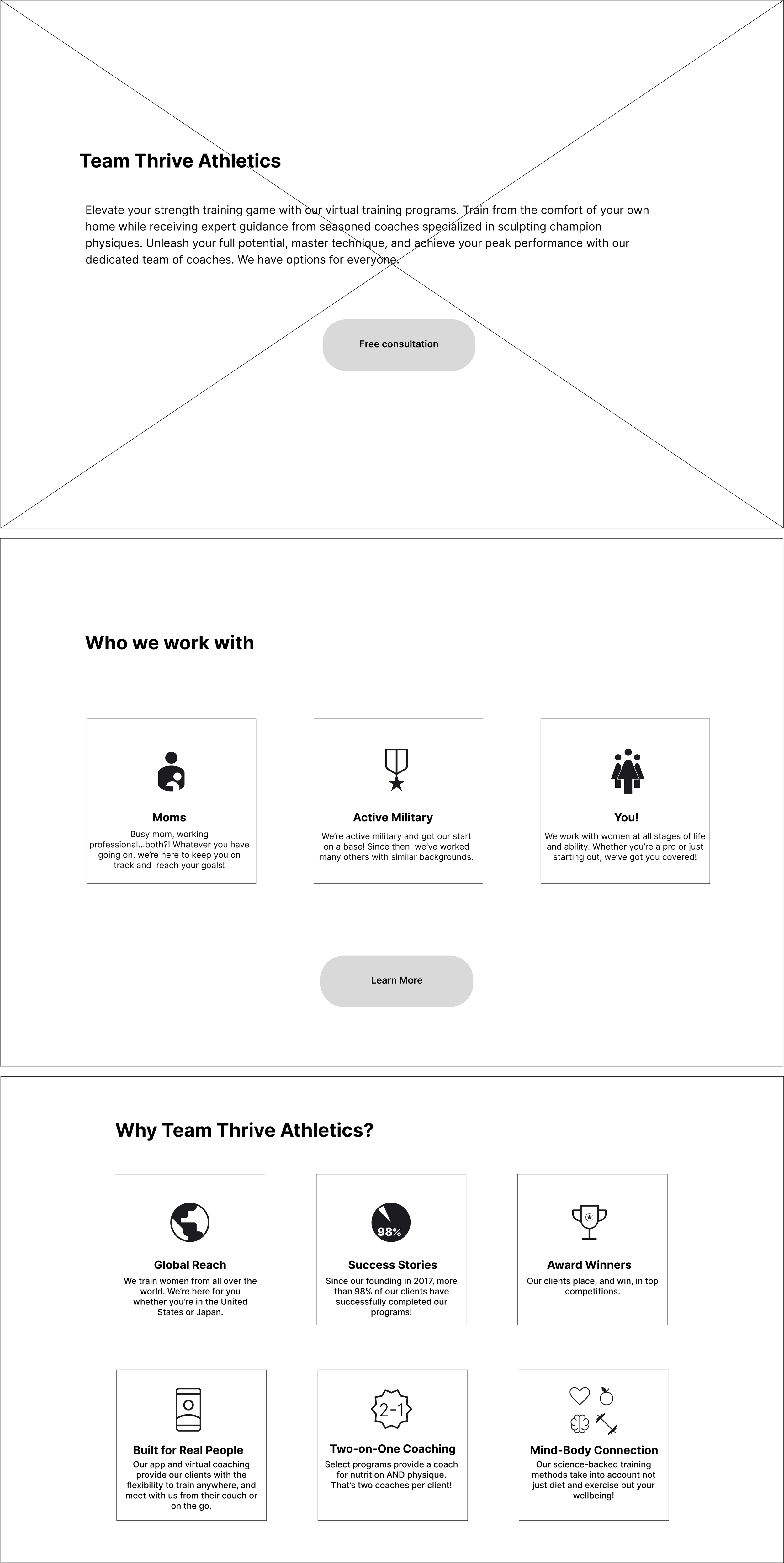
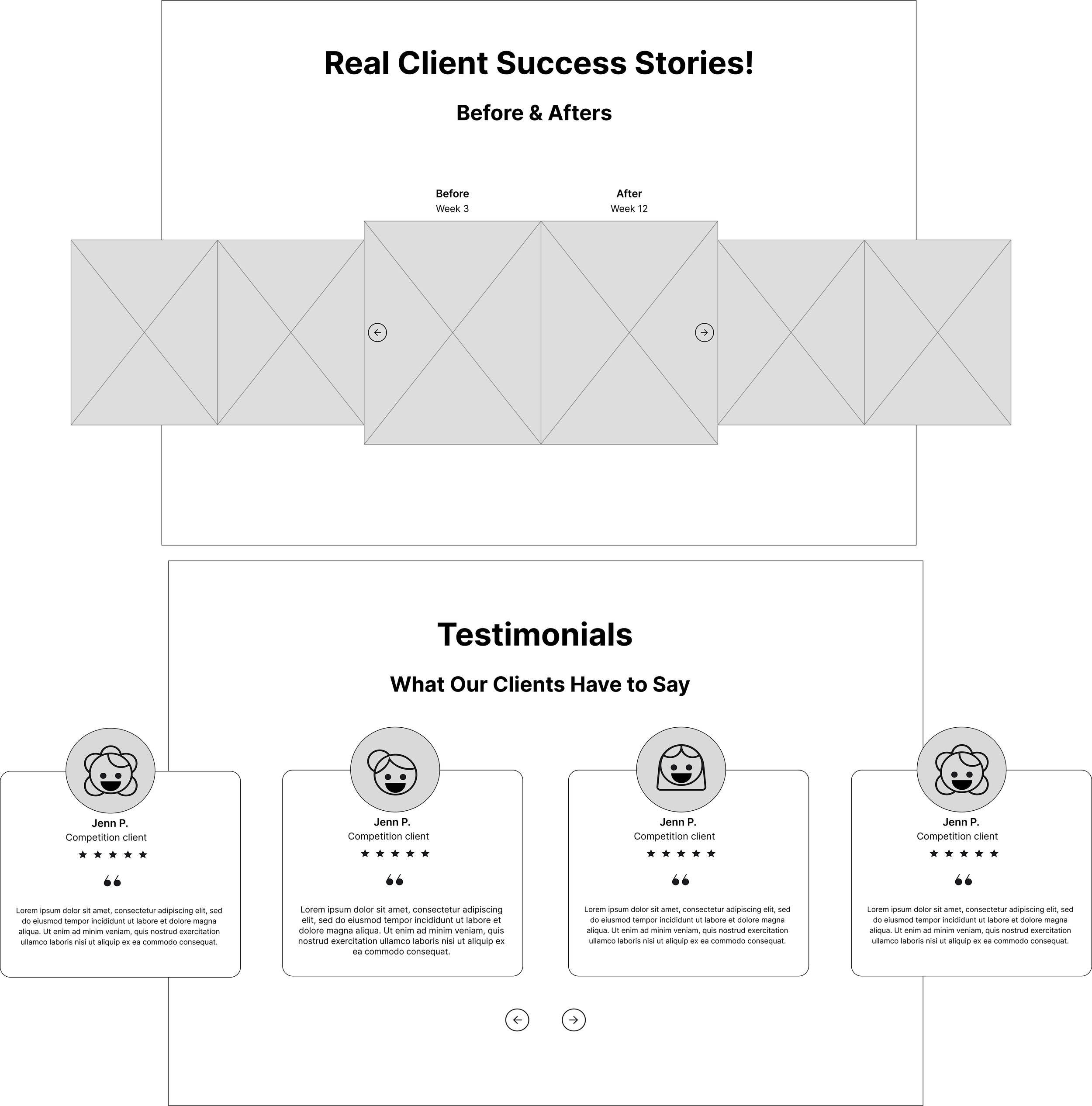
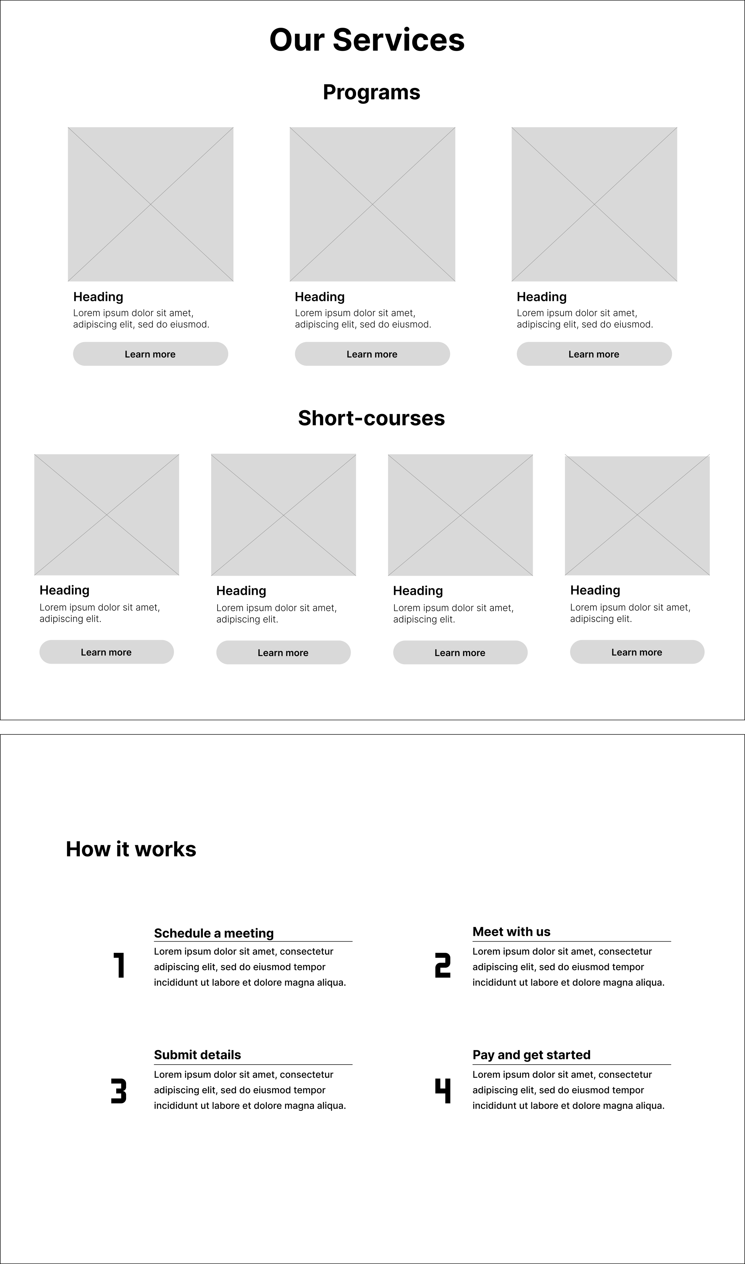
Lo-fi to Mi-fi Wireframes
I developed features based on the redefined problem statement and HMW, and based on the users’ feedback, created low fidelity wireframes for he home screen, about page, about coaches, and consultation form, mapping out where exactly key information based on the users’ goals.


Design
Branding & UI
Logo + Color Palette
Before: original logo and color palette

While there were some positive comments about TTA’s logo and color palette, “I like the color ways, the ‘80s vibe” and “The colors a cool juxtaposition between toughness and fem”, feedback during these interviews revealed that the colors were not accessible - interviewees had trouble reading the text and the logo didn’t translate well at smaller formats, “Typeface is hard to read, another treatment would be good” and “The Logo should be just the T because the “Team Thrive” is so small”.
After: new logo and color palette


For the redesign, I chose colors that were bold, energetic, exciting, and feminine that could provide high contrast and better accessibility. The stakeholders have an affinity for triangles so I designed several logo options where triangles were the focus. After feedback from peers and the stakeholders, I landed on the above logo, which replaces the A (in TTA) with a triangle, with bold legible text underneath. This can be used a logo or just a word mark.
Imagery + Brand Integration
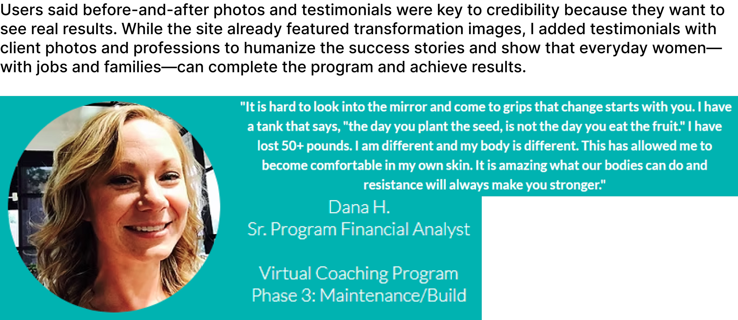
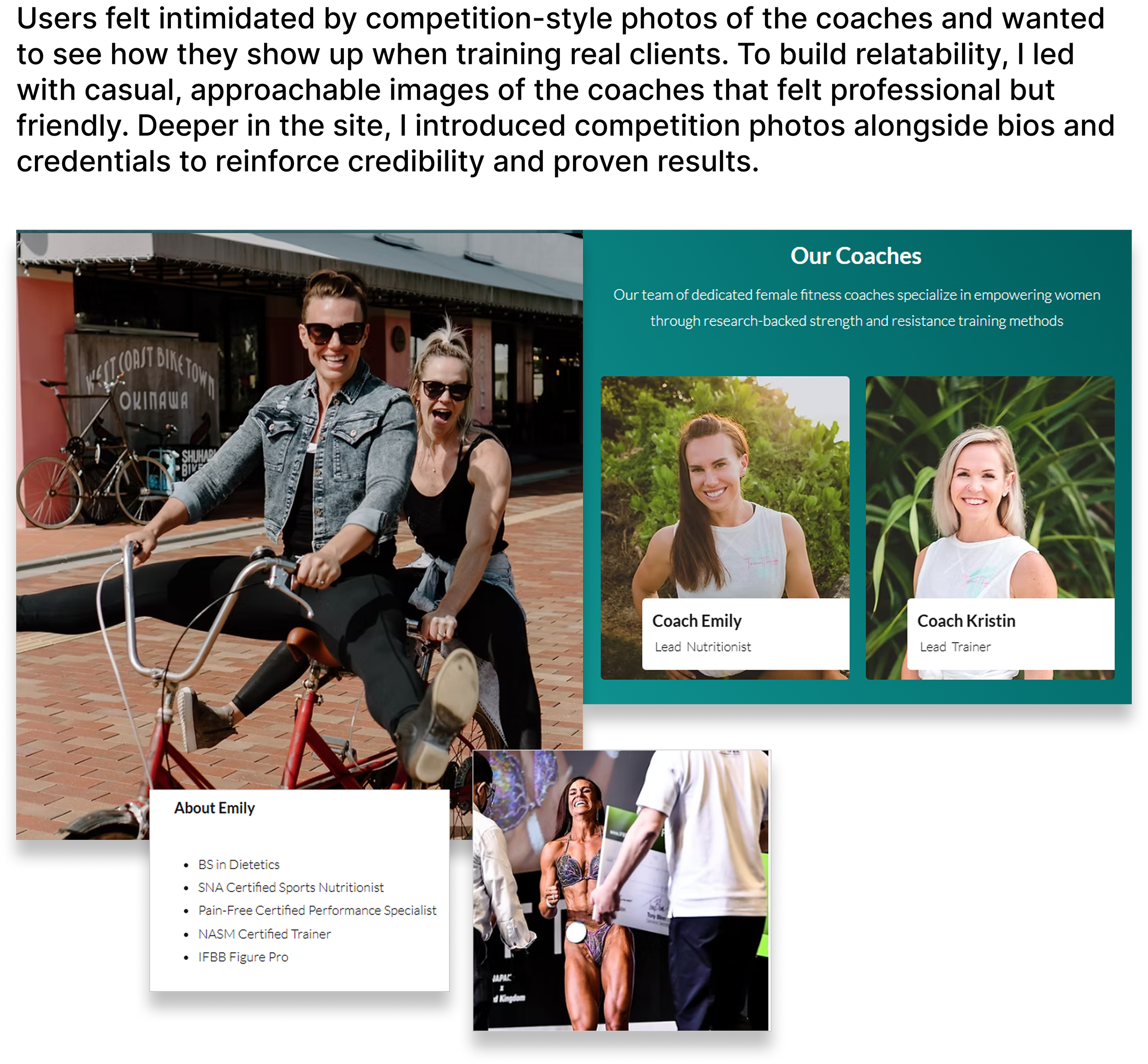
During the audit interviews, users had a lot to say about the imagery. Many found the depictions of body building overwhelming and intimidating. They wanted to see what the coaches looked like training clients - not just how they looked on stage at a competition.
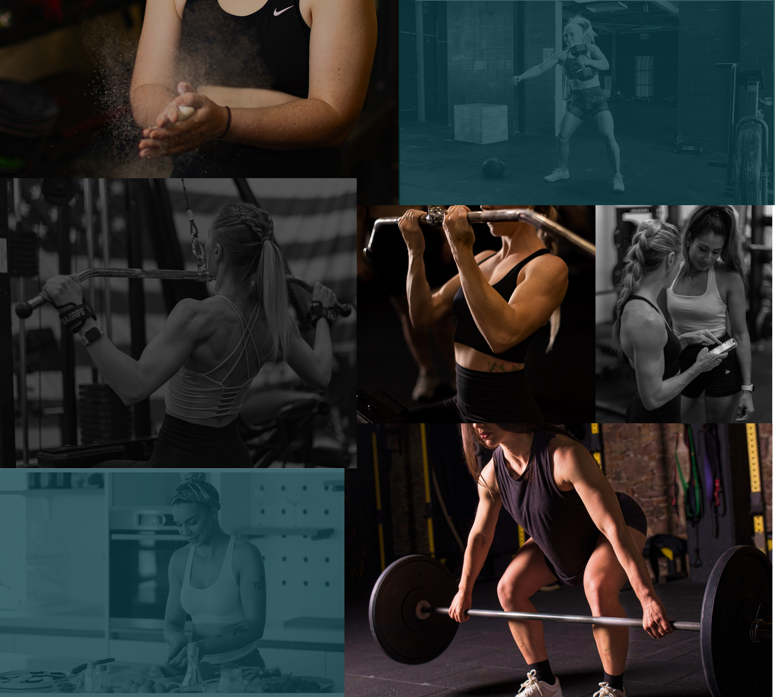
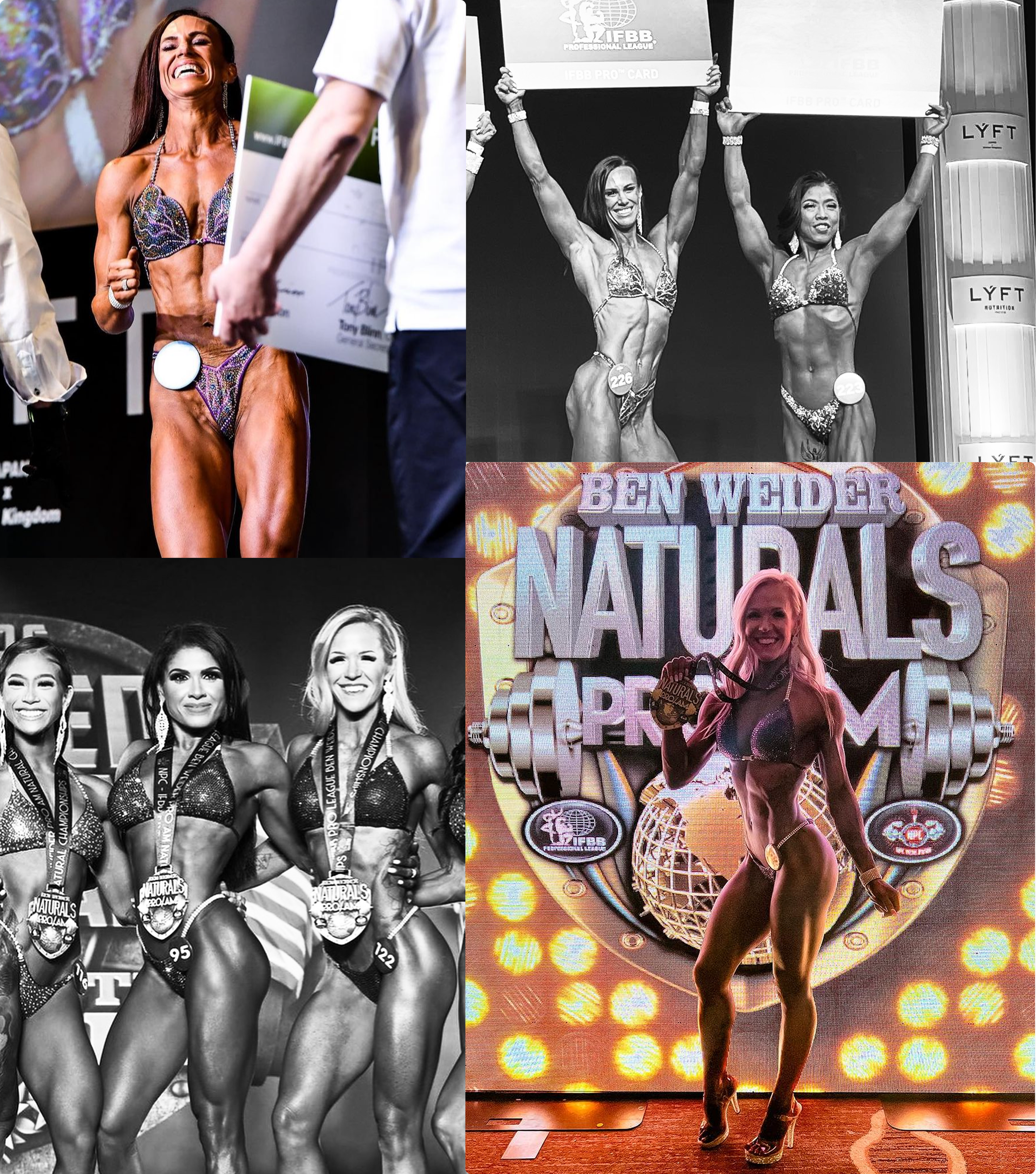
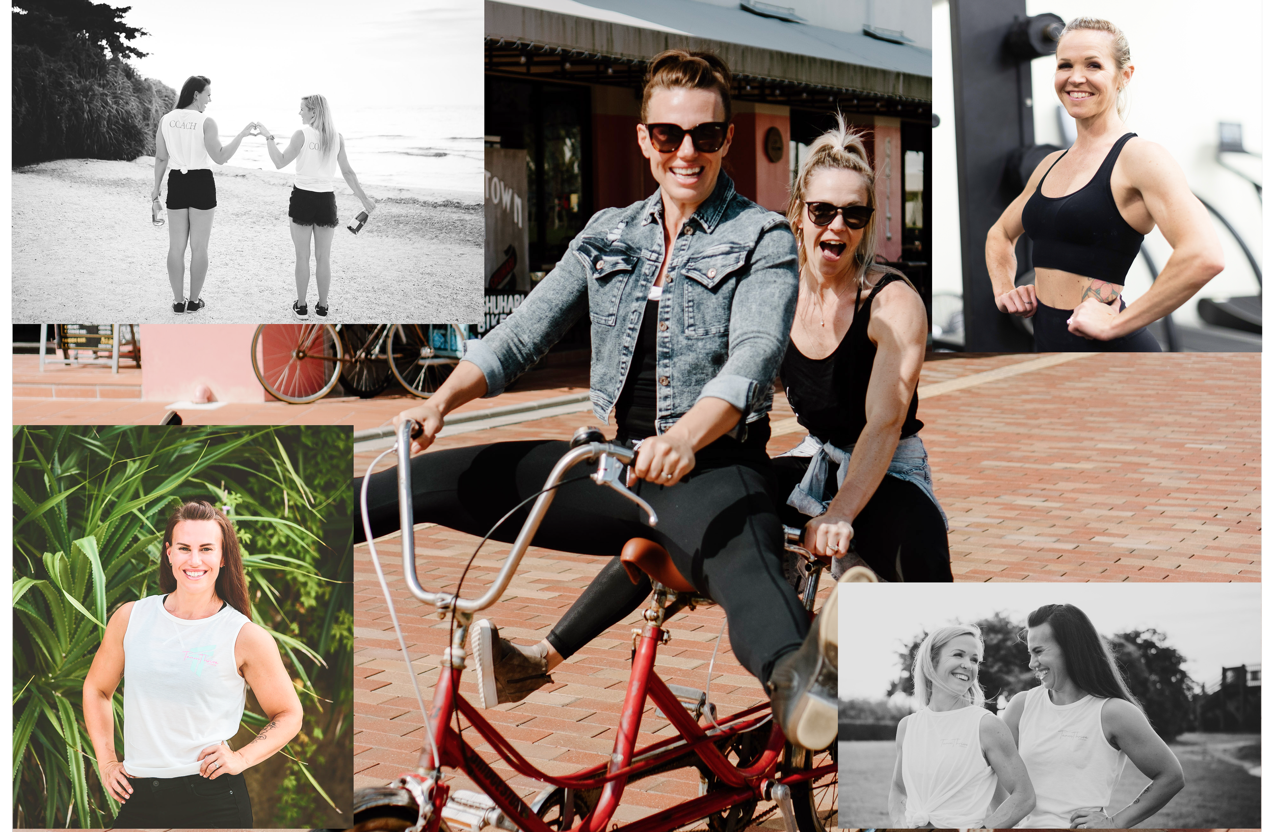
Top left: Overall imagery depicting strong feminine physique. Top right: coaches on-stage during competitions. Bottom: coaches in more relaxed environments wearing casual clothes or gym attire.
Hi-fi Wireframes
Pivoting After Stakeholder Changes
I designed the below high-fidelity wireframes based on the stakeholders current programming and message. When I presented the near-final screens to the coaches, the stakeholders shared that, after attending a business marketing program where they received feedback about their services, they decided to change three key factors of their business model.
They determined that they offer bodybuilding coaching with an option to compete, not separate programs of lifestyle and competition training.
Their ideal client is “someone who wants to be on stage" i.e. competing. Initially, they wanted to appeal to both these clients.
They will not put prices for the bodybuilding coaching on their website. They’re concerned that it’s scaring away leads. Instead, they will share the price during the consultation call. “We’ve had a lot of traffic to our website, but we don’t have as many leads. I think they see the price and think ‘Oh I can’t [afford] this right now’”.
Based on their new business model, I would re-design their programming layout and change copy to appeal to women interested in competitive bodybuilding.
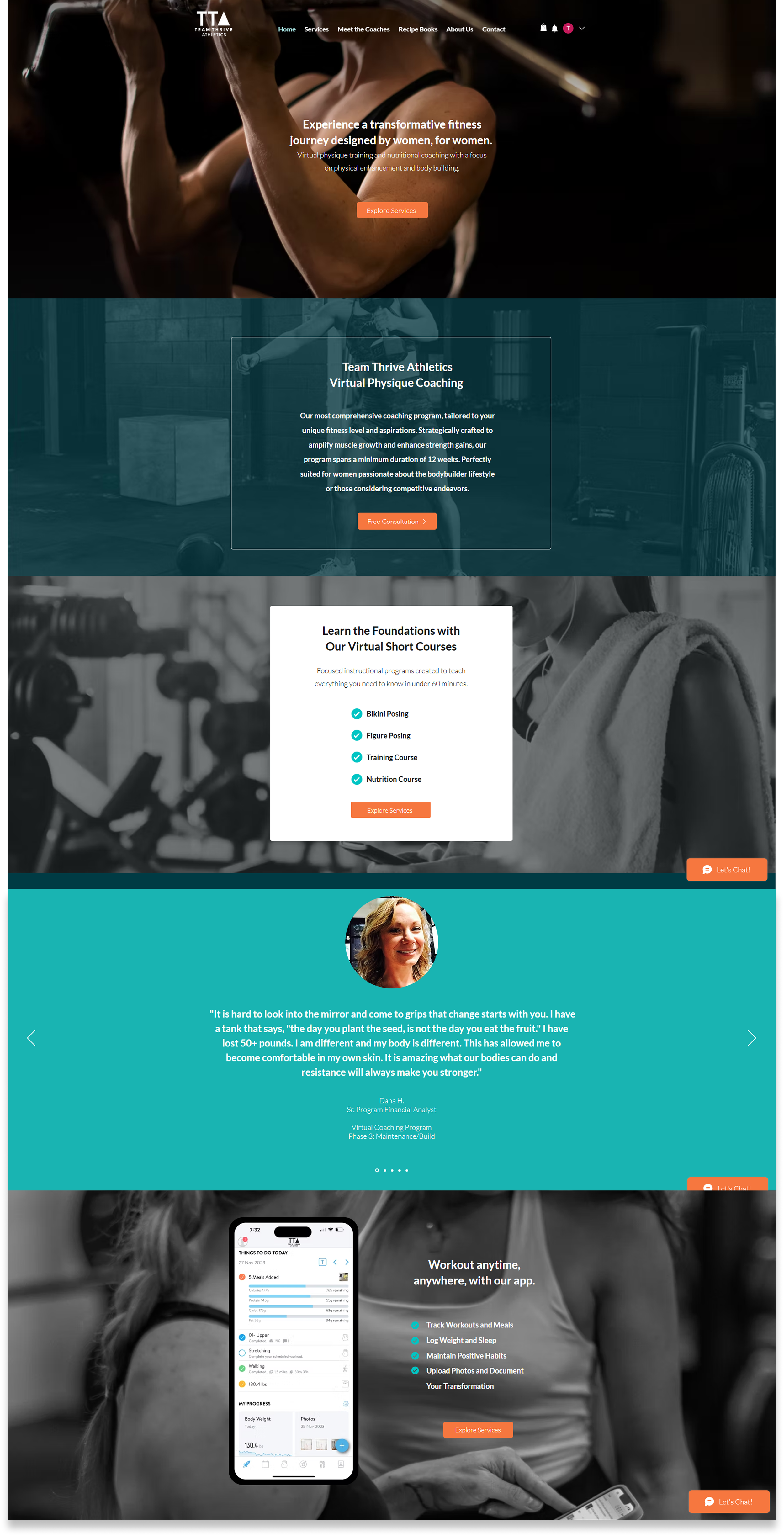
Home Screen
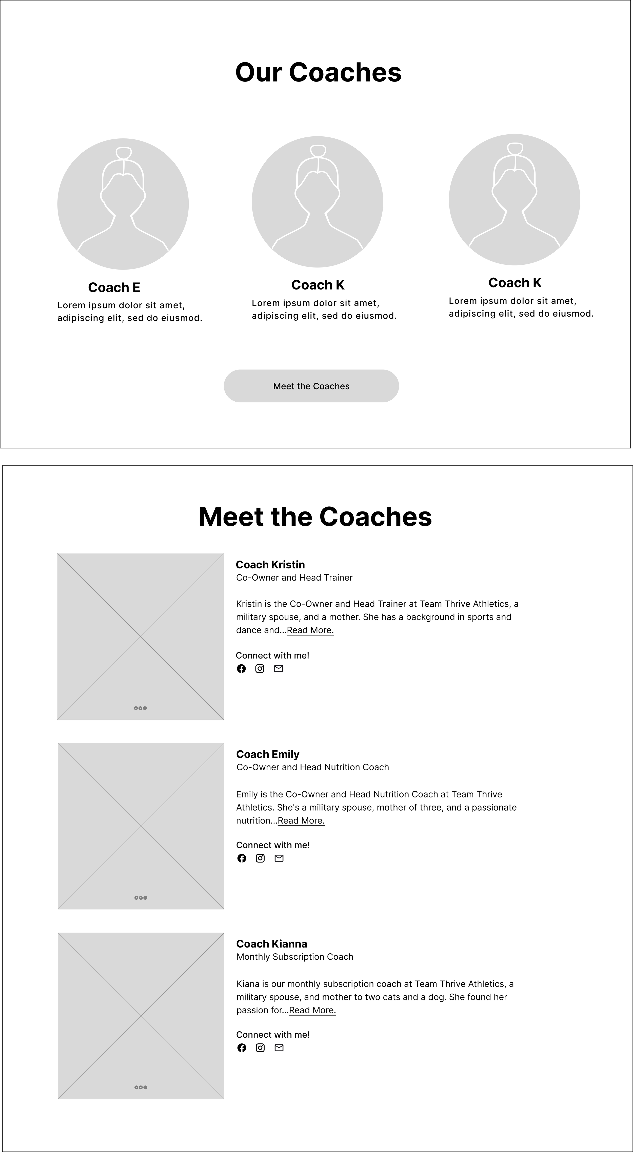
About the Coaches
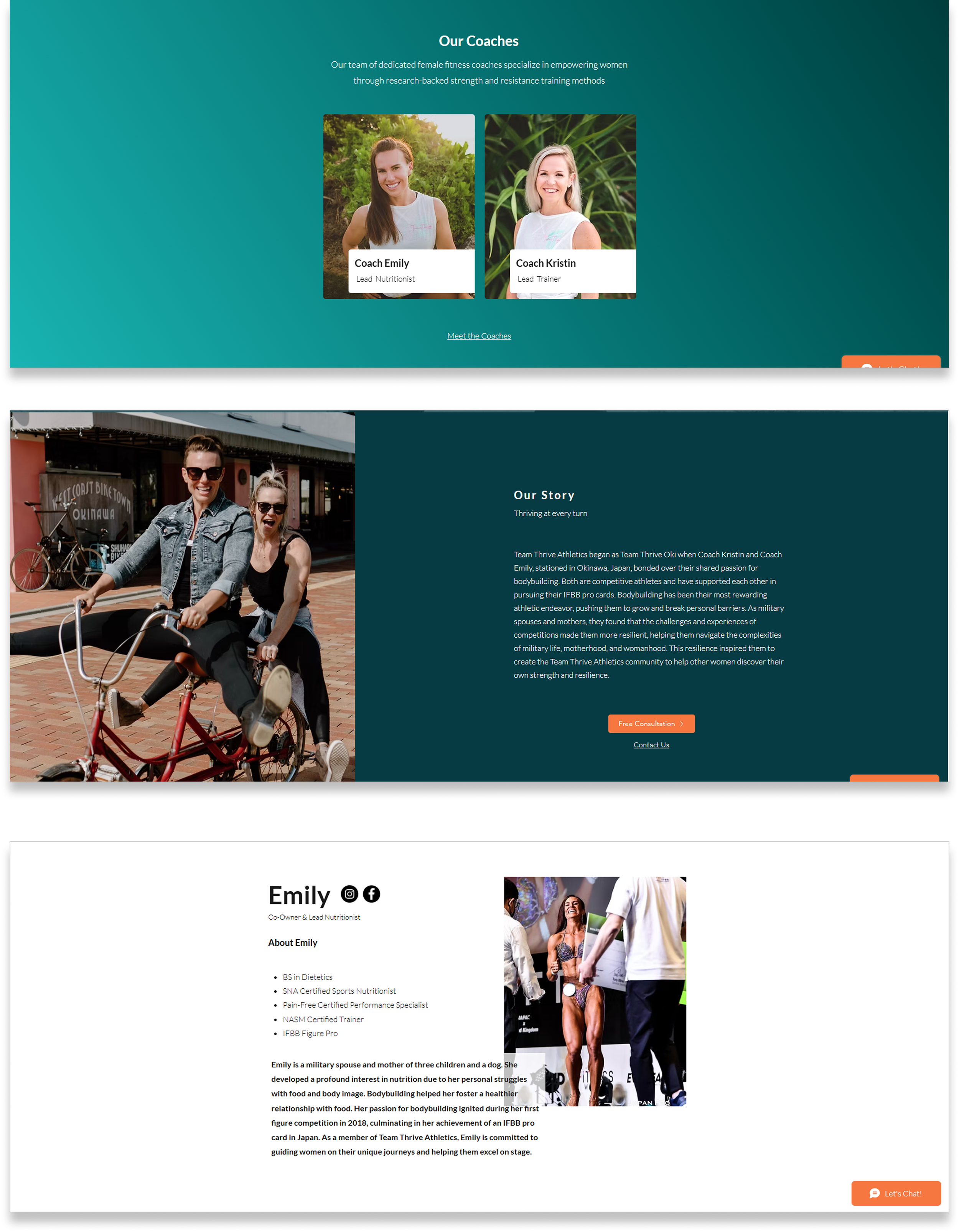
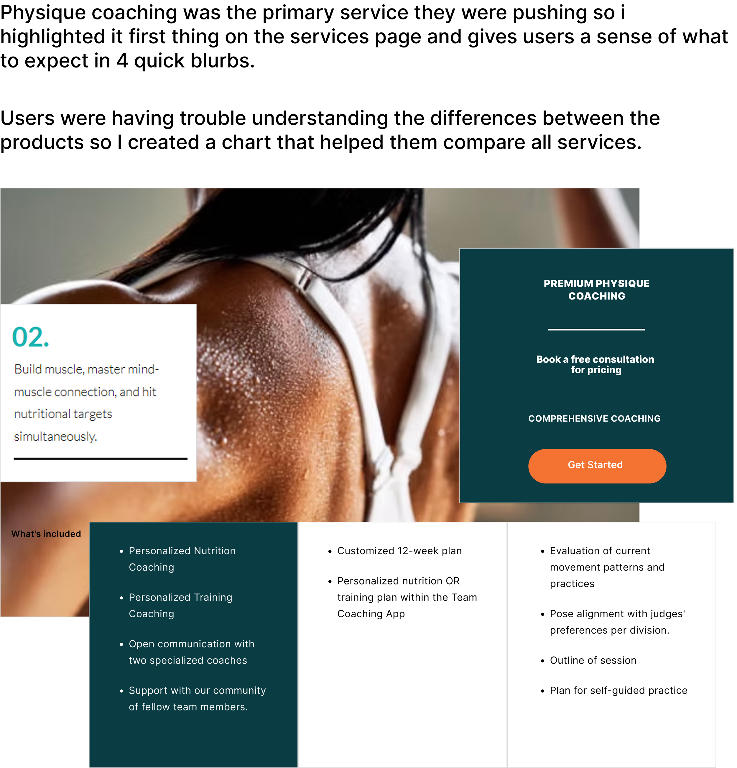
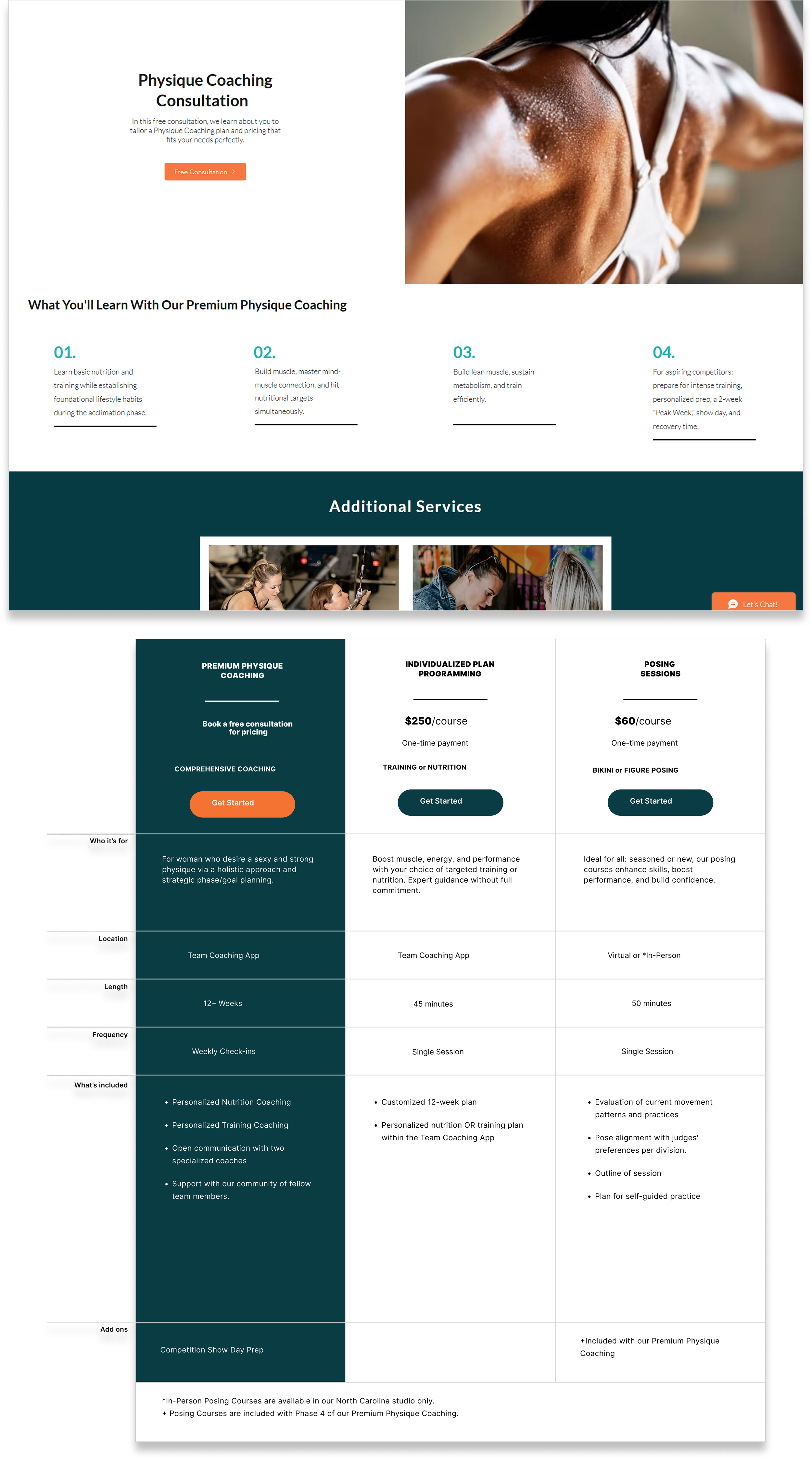
Services Page
Prototype + Testing
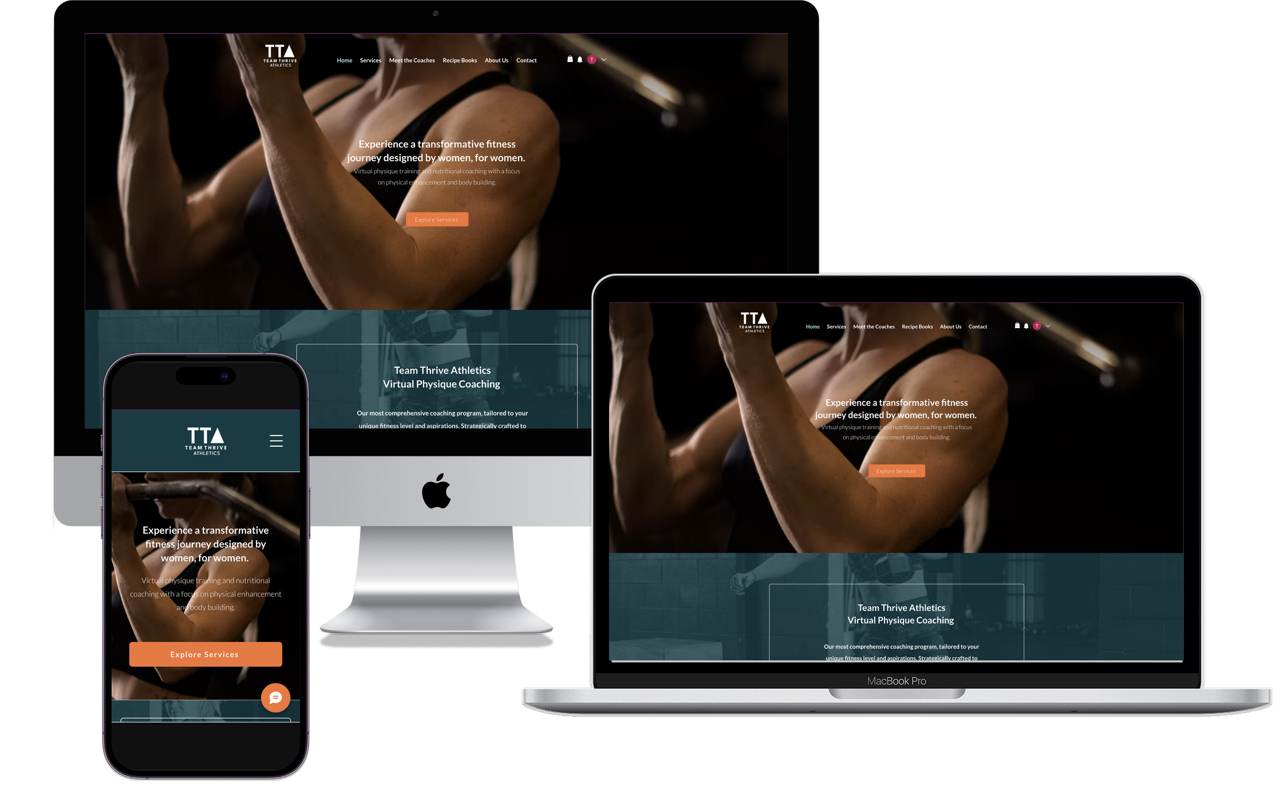
Final Design
I created high-fidelity wireframes as proof of concept. Once the stakeholders approved them, I laid the final design out in Wix. Because of this, I did not have a testable prototype. Instead, I returned about a year after I had completed the website and had users test the new site.

Select screens from the final design.
View the Website in Action
Below are screen recordings of the website in action, one for desktop and the second for mobile. I chose to video record to preserve the website as I had originally designed it. The stakeholders have changed the layout slightly since this case study was published.
Screen recording of the website for desktop.
Screen recording of the website for for mobile.
User Research Findings & Analysis
Overview
About a year after the website had been published, I had 5 participants complete a moderated usability test and interview of the redesigned Team Thrive Athletics website. The goals were to understand clarity of services, ease of navigation, trust perception, and emotional resonance with the brand’s positioning as “by women, for women.”
Each participant completed the same core tasks and quantitative ratings (1–10 scale). Qualitative responses were analyzed for recurring patterns, user pain points, and design opportunities.
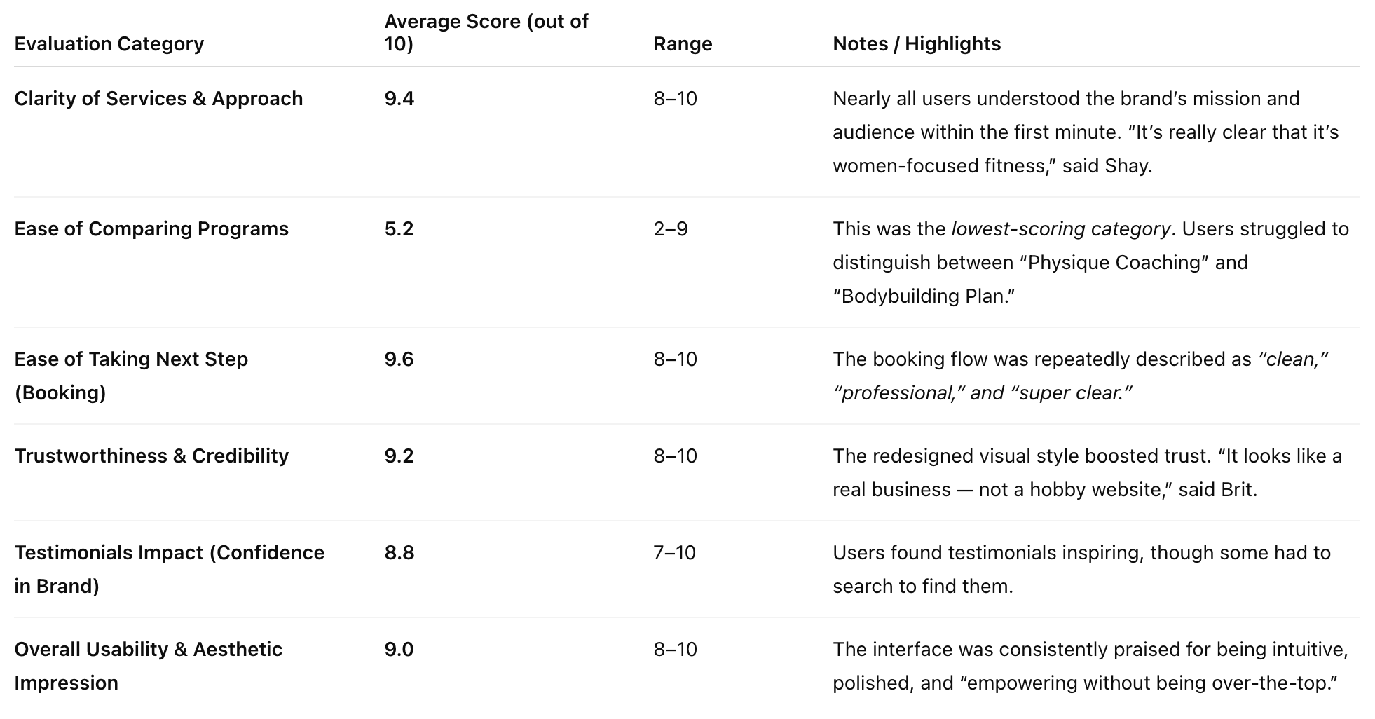
Quantitative Summary
The median evaluation score among all categories 9.1! Notably, users rated (out of 10) ease of booking a 9.6, clarity of services a 9.4 , & trustworthiness + credibility a 9.2. The lowest ranking was ease of comparing programs at 5.2. I was disappointed that, despite my best efforts, the programming comparison chart I designed wasn’t successful.
Next Steps
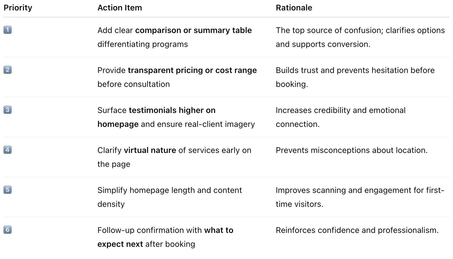
Design Opportunities / Action Items (Ranked by Frequency of Mention)
User pain points during testing included unclear program differentiation, lack of pricing transparency, testimonials too low on the page, homepage too long, & virtual model not obvious. Based on user feedback, I created the below chart with next steps and prioritized them by how frequently the issue was mentioned during the interviews. As you can see, creating a clearer comparison chart is priority #1!
FINAL THOUGHTS
Working with real clients strengthened my ability to navigate ambiguity, adapt to evolving requirements, and make intentional design tradeoffs within real business constraints. Redesigning the site end-to-end gave me experience across the full product lifecycle, from discovery through execution, while close client collaboration reinforced my strength in co-creation—clarifying stakeholder needs, aligning expectations, and translating loosely defined ideas into actionable direction. As priorities shifted, I learned to reframe scope, phase delivery, and focus effort on the highest-impact improvements.
Operating within a new platform environment sharpened my ability to assess feasibility and manage delivery risk through rapid learning and early validation of technical assumptions. Across stakeholder conversations and research cycles, I uncovered core user and business needs while building confidence navigating real-world complexity—strengthening my judgment, adaptability, and collaborative approach to prioritization, stakeholder alignment, and outcome-driven design.