
AutoMHatic Loan Application Review Dashboard
Designing a Faster, Clearer Review Workflow Using OCR
PROJECT OVERVIEW
As UI/UX Designer & Researcher, I led the design of two high-fidelity wireframes for AutoMHatic’s MVP, translating complex operational needs into a streamlined user experience ready for developer handoff. AutoMHatic, a manufactured home lender, uses AI to scan applications and extract data, but verification gaps introduced friction and delays. The challenge was to design a system that allowed users to quickly complete missing information and streamline processing time.BACKGROUND
I designed a high-fidelity dashboard for managing all loan applications and a dedicated workflow for correcting missing or inaccurate OCR data, accommodating significant variability in required fields across application types. Data clerks needed to quickly review applications, identify OCR gaps, and resolve errors across thousands of records. The product aimed to reduce manual data entry and human error while increasing processing speed by up to 2000% (18–24×), which I later evaluated through post-launch virtual interviews with three data clerks.
CONDUCTING RESEARCH
I interviewed the Project Manager to understand the business, users, challenges, and the new OCR workbench solution. Previously, all data entry was manual and time-consuming.
“How might we more efficiently guide the user through the application so they know which fields need review, so they can complete more applications within a shorter period of time, increasing productivity without sacrificing work quality?“
TASK FLOW
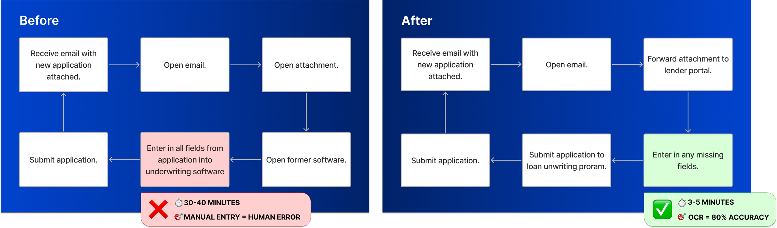
Now, when a PDF application is emailed in, the lending portal uses OCR to extract text. Characters with 80%+ confidence are auto-captured, while anything below that threshold requires human review and manual entry.
MVP Design & Launch
PHASE 1
LOW-MID FIDELITY WIREFRAMES
Based on the new user flow, I sketched several different screen options to share with the Project Manager, who I met with once a week for about 4 weeks. I would build on his feedback eventually creating high-fidelity wireframes.
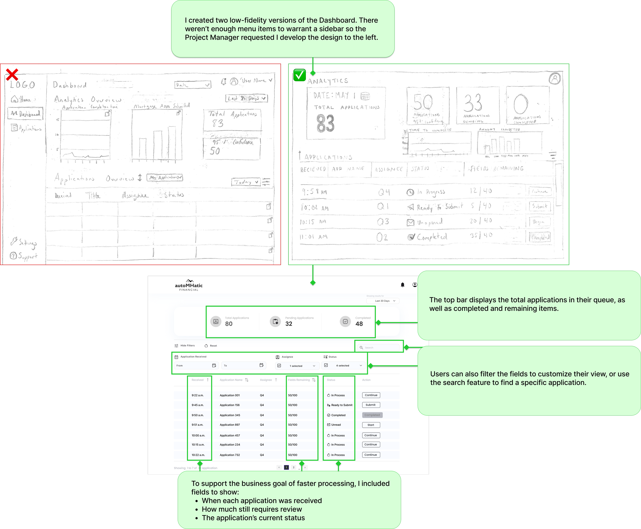


Three low-fidelity application wireframes

Mid-fidelity application wireframe - iteration 1

Mid-fidelity application wireframe - iteration 2
APPLICATION REVIEW
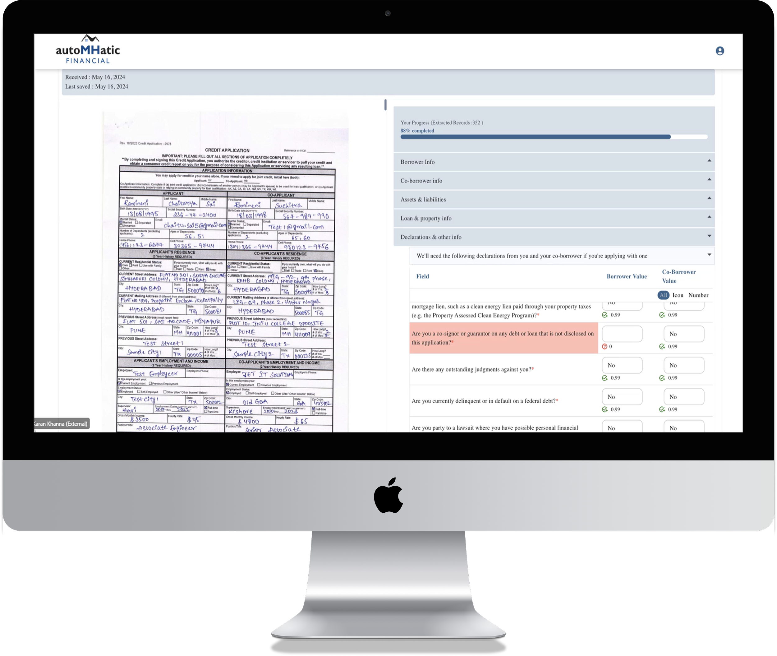
I designed three options for the application review screen, including one with an enlarged document view as requested by the project manager. After exploring a mid-fi version that allowed in-document editing (later ruled out due to engineering constraints), I created a layout with entry fields on the left and a minimized page preview on the right to maximize workspace.
The project manager and I mapped out the field types and OCR behavior, which informed a structure of collapsible sections that let users review the application step-by-step. Icons indicate required review, OCR confidence, and intentionally blank fields. I also added a progress bar showing estimated review time and overall OCR confidence to help users manage their workflow.
Users can’t submit the application until all required fields are completed
The UI uses icons, color, and text to relay meaning to the user so they can quickly understand the actions required to complete their tasks in a timely manner. This product is an MVP, used internally by the company. My focus was a color palette that was accessible, with simple contrasting colors like black, white, grey, and blues. The secondary palette was green, blue, and red, colors that indicate actions for the user.
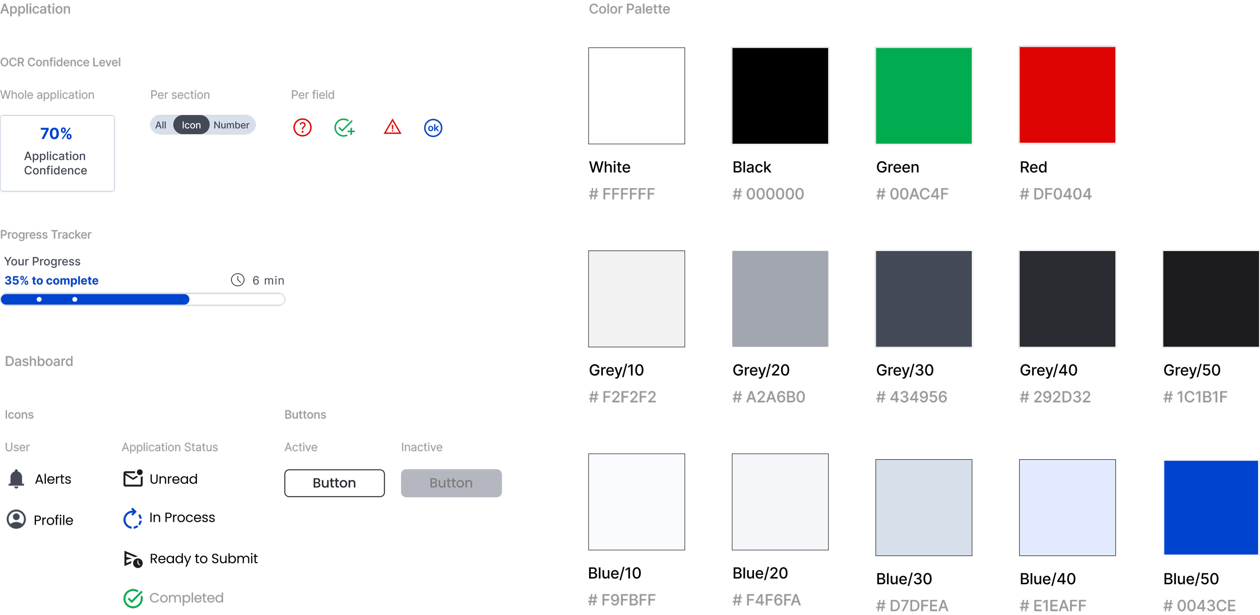
UI + COLOR PALETTE
FINAL DESIGN
The final designs included adding color and more iconography to help the identify tasks quickly. These screens were handed off to the developers to build the MVP.
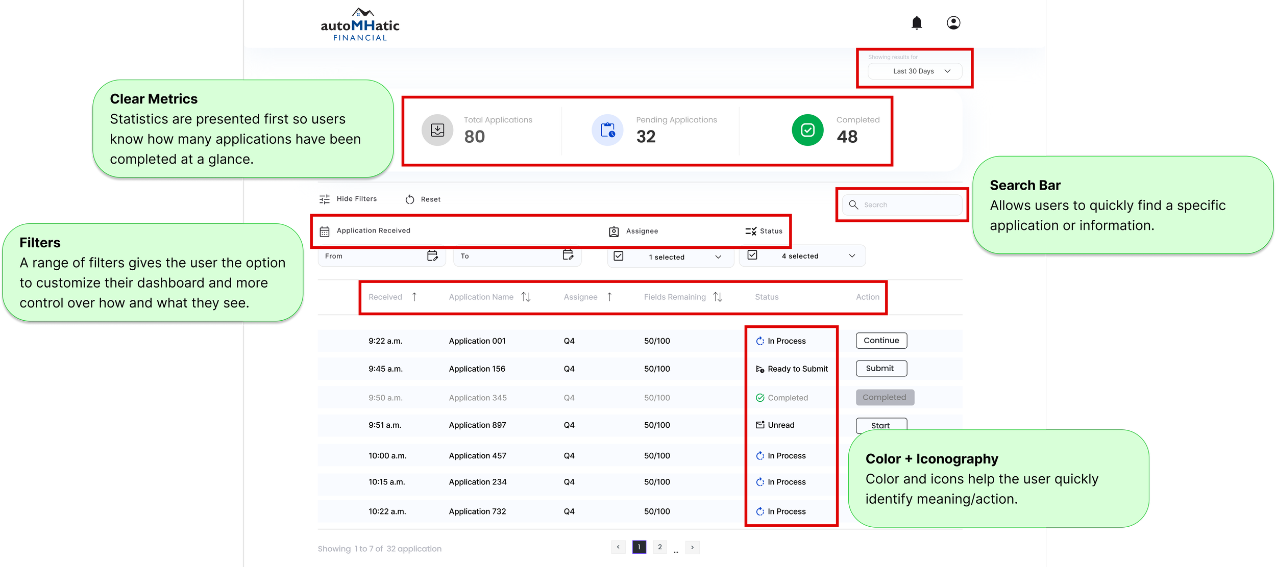
Final design for high-fidelity dashboard.
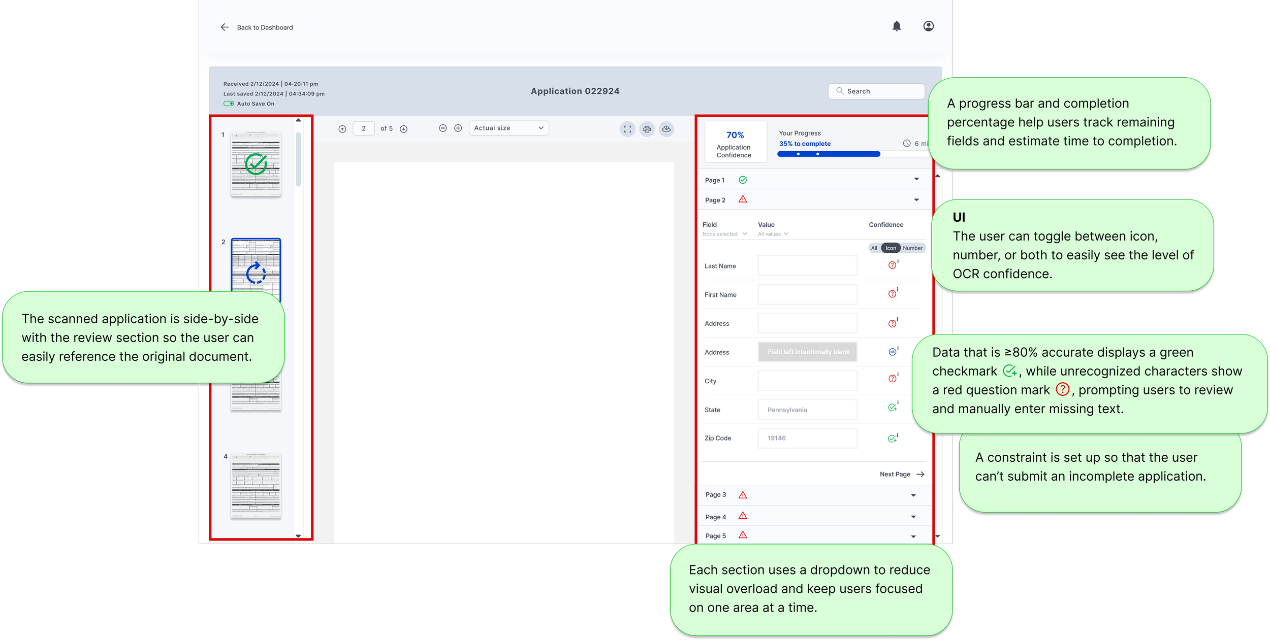
Final design for high-fidelity application.
MVP
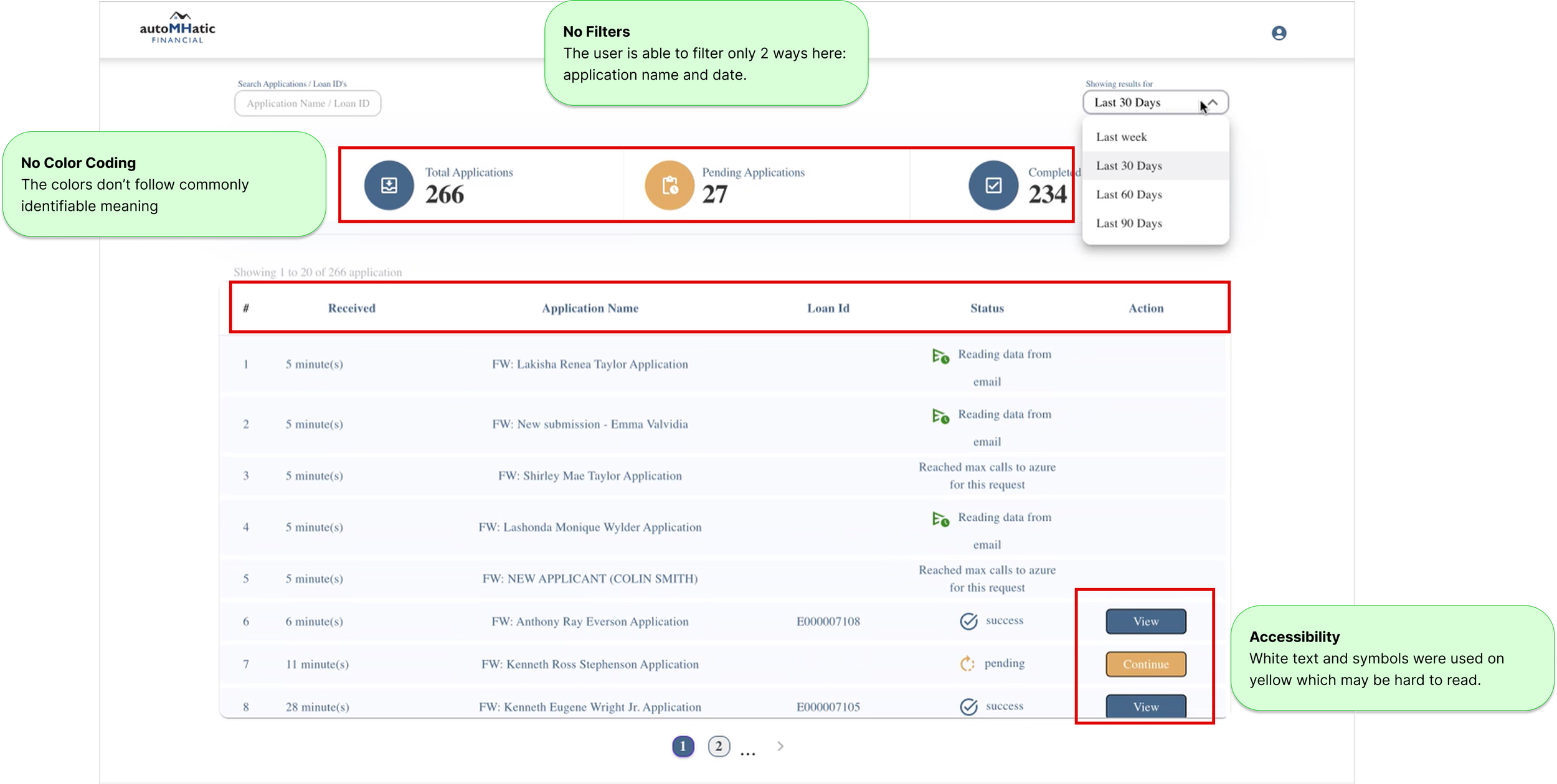
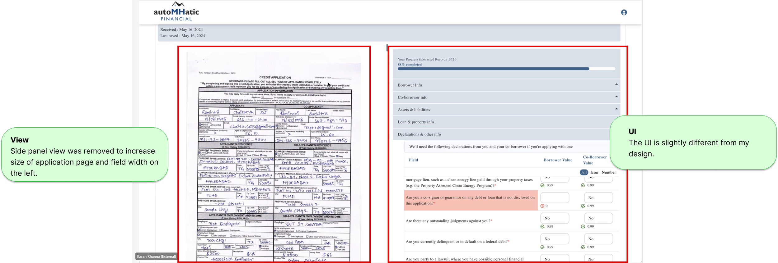
A few months after handing off the high-fidelity dashboards, the project manager shared the working MVP built from my designs.
I recommended adjusting the colors to better align with my original design, both to clarify required actions and to improve accessibility, since white text on a yellow background may not provide sufficient contrast. I also noticed that the team removed the sidebar to enlarge the application view, which was a strong improvement for usability.
Post-Launch Learning
PHASE 2
I completed this case study as a project requirement while a student at Designlab. I returned 1.5 years later to complete additional research required by Designlab to graduate. In Phase 2, I performed a competitive analysis and user interviews, and created a user flow based on feedback from the interviews.
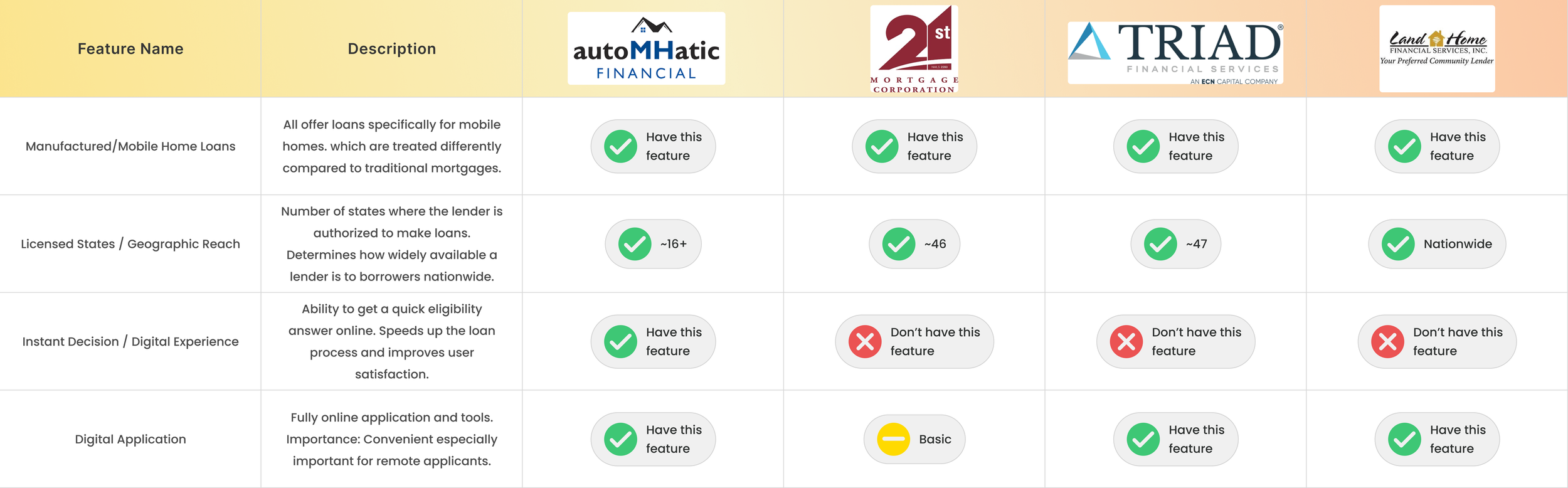
COMPETITIVE ANALYSIS
I reviewed three manufactured-home lenders and learned that the MH market operates very differently from traditional mortgages: it carries higher risk, requires a more rigorous application process, and often results in higher rates and fees. Lenders with MH expertise are especially valuable because buyers must navigate a unique, outdated purchase process where dealers still rely on paper applications that are manually entered or emailed to loan officers. This makes aLLoan’s product for AutoMHatic particularly significant, as they are the only MH lender offering a digital application with instant decisioning.
INTERVIEWS
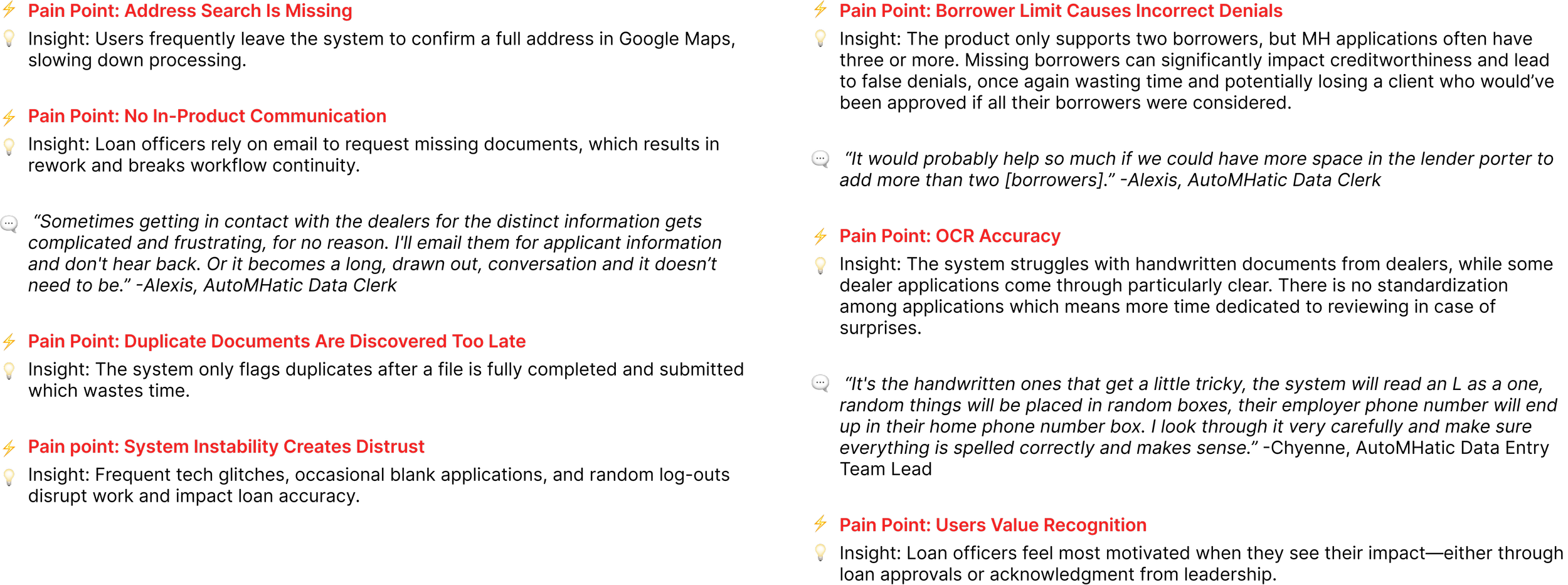
After the product had been in use for about 1.5 years, I interviewed three users to learn about their experience.
PAIN POINTS + KEY FINDINGS
USER FLOW
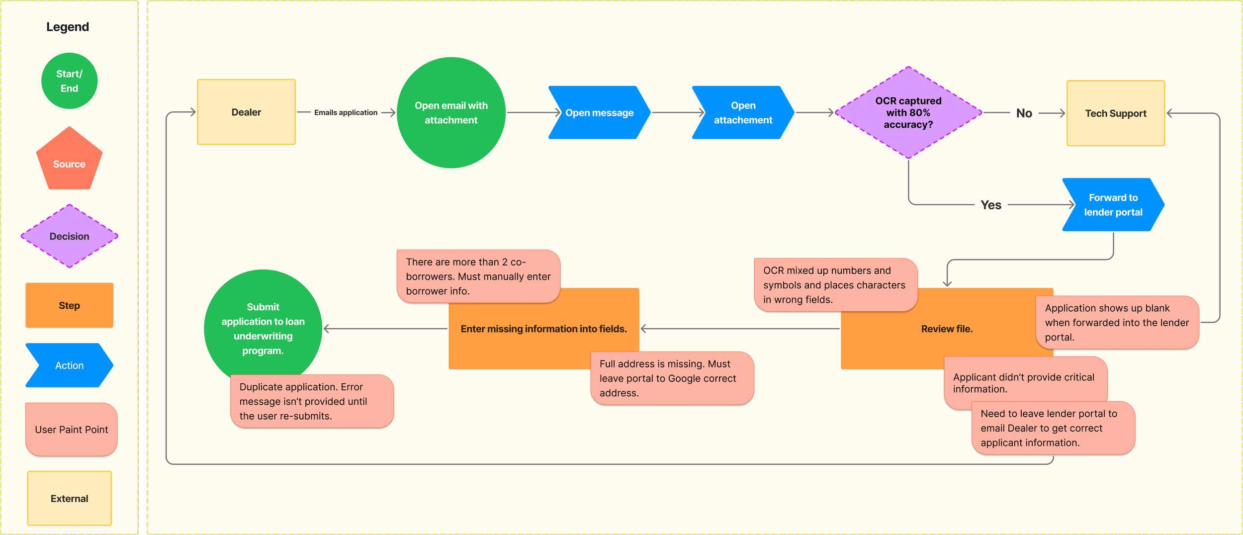
After interviewing the users, I created a user flow to visualize their process better and understand where in flow they were experiencing issues.
STORYBOARDING
The commonality among the users’ pain points was that they all delayed the application for being processed, thus prolonging the application processing time. When devising the storyboard I returned to the business’s goal of timely application processing and considered how all these hold ups would make the user feel.

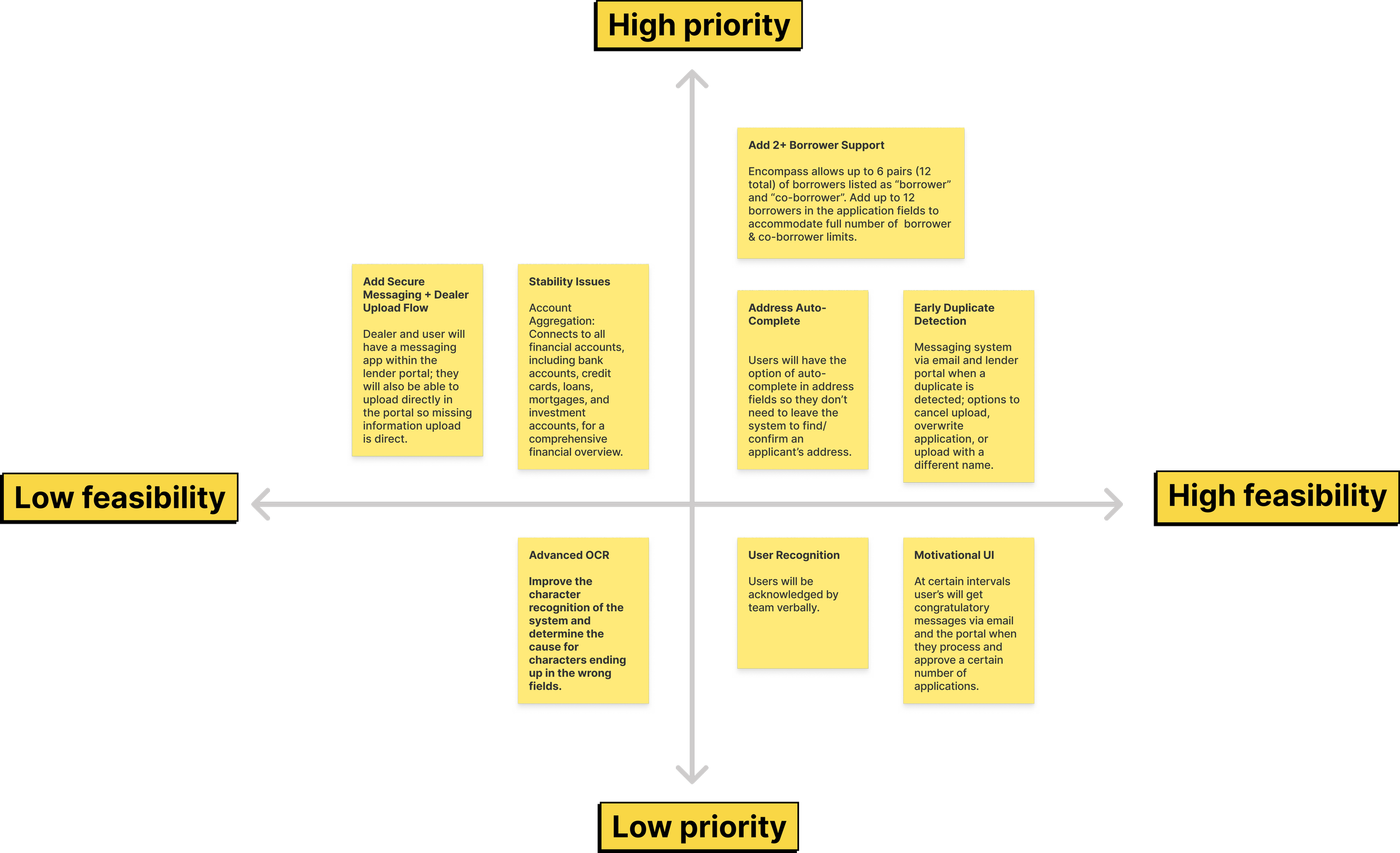
NEXT STEPS
In the next phase, I would focus on the prioritized solutions listed below to address the users’ pain points. They’re organized by level of urgency and difficulty to determine which would have the most impact.
LEARNINGS & TAKEAWAYS
Constraints drive focus
Real-world limitations became a prioritization framework, helping me concentrate on high-impact decisions that balanced user needs, business goals, and delivery realities.
Designing within existing systems
Rapid domain research and workflow alignment were critical when joining an established product, reinforcing the importance of designing for real operational contexts.
Agile collaboration accelerates clarity
Structured iteration cycles and frequent feedback loops made tradeoffs between scope, usability, and timelines explicit and easier to resolve.
Engineering partnership shapes better UX
Developer feedback reduced technical complexity, kept the feature within MVP scope, and improved delivery speed without compromising usability.
Measurable business impact validates design
Application time dropped from 10+ minutes to 3–5 minutes, enabling loan decisions in under 10 minutes instead of 3–4 hours — a 90%+ reduction in decision time.
Post-launch research unlocks next-phase value
Re-interviewing users 1.5 years later surfaced new usability gaps and informed data-backed phase-two optimizations.
Product-minded UX skills strengthened
This project reinforced prioritization, cross-functional collaboration, operational efficiency, and tying design decisions directly to quantifiable outcomes.