
HomeEconomics: End to End Mobile MVP
Building Trust and Confidence in Millennial Money Management
PROJECT OVERVIEW
HomeEconomics is a financial literacy app tailored to millennials, a generation that often experiences anxiety, distrust, and decision paralysis around money management. As the UX/UI Designer and Researcher, I created three high-fidelity mobile prototypes and conducted user testing to identify a viable MVP. The goal was to build a clear, motivating, and trustworthy tool that supports users’ goals while reducing the overwhelm of planning for stability, experiences, and long-term milestones.ROLE: UI/UX Designer + UX Researcher
STAKEHOLDERS: This is a theoretical project as a student at Designlab
TIMEFRAME & COMPLETION: 4 weeks, 2025
FIELD: FinTech
BACKGROUND
Millennials—born between 1981 and 1996—entered adulthood during the financial crisis and received less federal support than previous generations, contributing to skepticism toward financial institutions and lower financial confidence. Although many financial tools exist today, a lack of foundational literacy makes them difficult to navigate and easy to disengage from. Research highlights this gap: only 11% of millennials score highly on the TIAA Institute–GFLEC P-Fin Index, while 28% demonstrate very low financial literacy—underscoring the need for products that build both confidence and competence in personal finance.
This project aimed to understand millennials’ emotional and psychological relationship with money, uncover what motivates them to improve financial literacy, and identify sources of overwhelm and opportunities for meaningful support. Insights from qualitative research informed the design of a financial tool that prioritizes clarity, emotional safety, and sustained engagement—helping users feel more confident, capable, and motivated to continue building healthy financial habits.
Success was measured by:
Increased self-reported confidence and reduced anxiety when engaging with financial concepts and decisions during usability testing.
Stronger engagement intent, reflected in users expressing enjoyment, clarity, and willingness to continue using the product over time (e.g., positive usability feedback, stated likelihood to reuse).
RESEARCH METHODS
User interviews
Competitor analysis
Affinity mapping
Usability tests
COMPETITIVE ANALYSIS
I compared You Need A Budget (YNAB), Paven, and Betterment, three finance apps that my interview subjects brought up, that offer their users budget and provide personalized financial guidance.
Similarities
All platforms charge for their services (subscription or percentage-based).
Each offers personalized experiences guided by user inputs.
All provide financial guidance or education to support better decision-making.
Each helps users manage finances through investing (Betterment), budgeting (Paven, YNAB), or both.
All include financial activity tracking (investments, spending, or budget adherence).
They encourage goal setting across savings, budgeting, or investments.
All emphasize simple, user-friendly interfaces to reduce friction.
Borrowed breadth, avoided silos: Competitors tended to specialize in a single niche (education, budgeting, or investing). I intentionally avoided this fragmented approach and designed the MVP to balance all three equally, giving users a holistic, personalized view of their finances rather than forcing tradeoffs.
Elevated education to a core feature: While many platforms treated education as a secondary or “nice-to-have” feature, I centered it as a primary function in the MVP to build confidence, reduce anxiety, and support informed decision-making over time.
Added guided growth through automation: To bridge the gap between learning and action, I included a robo-advisor concept in the MVP, providing users with scalable guidance as their financial knowledge and goals evolve.
Differences
Pricing models differ significantly across platforms.
Paven focuses on education, while YNAB focuses on budgeting behavior and Betterment on investment management.
Paven is employer-distributed, unlike YNAB and Betterment.
YNAB and Paven do not offer investing, whereas Betterment is investment-centric.
Product positioning varies: YNAB = budgeting app; Paven = budgeting + education; Betterment = robo-advisor.
Betterment offers comprehensive financial planning; Paven and YNAB stay closer to budgeting.
USER INTERVIEWS
I conducted exploratory interviews with six participants who were born between 1984-1995 to understand how millennials think, feel, and make decisions about their finances, focusing on users’ daily money habits, emotional relationship with finances, trust in financial institutions, experiences with financial apps, long-term goals, and gaps in financial literacy. The questions explored topics such as budgeting behaviors, financial anxieties, learning preferences, decision-making challenges, and the impact of life events (like turning 30 or experiencing job instability). This helped me uncover the deeper motivations, frustrations, and needs that shape how users interact with financial tools—insights that ultimately informed the product’s features, tone, and overall design strategy.
KEY FINDINGS
Anxiety
Money triggered stress, avoidance, and fear-based behaviors rather than proactive planning.
Financial tools often felt overwhelming or judgmental, increasing emotional friction.
Turning 30 and peer/family expectations amplified pressure to feel financially “on track.”
Users wanted to feel prepared for unexpected life events, not just manage expenses.
“I don’t spend money out of fear.”
Trust
Users expressed strong mistrust of financial institutions and financial apps.
Low financial literacy made users hesitant to act on recommendations they didn’t understand.
Financial advisors felt expensive and inaccessible, limiting access to trusted guidance.
Users wanted supportive, non-judgmental tools that felt aligned with their interests.
Jargon
Financial terminology created cognitive overload and discouraged engagement.
Users preferred plain language and contextual explanations over complex concepts.
Dense interfaces reinforced feelings of being behind or unqualified.
Clarity and progressive disclosure were critical for building confidence.
“I don't want to spend much of my personal time on [financial] jargon.”
Decision Paralysis
Information overload and unclear next steps caused users to abandon tasks.
Distrust increased perceived risk and slowed decision-making.
Taxes were a major stressor due to complexity and fear of costly mistakes.
Users wanted lightweight guidance to support small, confident actions.
Key Learnings
There is no single “right” way to budget—different users benefit from different systems and philosophies.
Users vary widely in how they learn about money, so offering multiple ways to learn (visual, interactive, scenario-based) increases engagement.
Technical reliability and clean UI are critical—especially for products requiring secure bank syncing or real-time data.
Personalization is a powerful driver of engagement; these products succeed when users feel the experience is tailored, relevant, and responsive to their unique financial lives.
Opportunities
Build a product that teaches financial concepts and applies them to users’ real data in real time.
Offer low-cost or free premium guidance, including human or AI-assisted support.
Introduce an AI financial assistant for personalized answers, insights, and actions.
Create a “robo-teacher” that simplifies complex decisions into small, doable steps.
Provide bite-sized, non-overwhelming education alongside budgeting and goal setting.
Help users identify immediate actions they can take based on their current financial situation.
Combine learning, budgeting, and planning into a single, confidence-building ecosystem.


PERSONAS
From my interview findings, I created two personas as interviewees seemed to fall into one of two categories: cautious spender or carefree spender. While their attitudes differ when it comes to budgeting (or lack thereof!) both groups do not have the confidence or knowledge to make informed financial decisions, and want to increase their financial literacy to achieve their personal goals.
The Refined Problem
Millennials experience high financial anxiety—particularly around credit cards, taxes, and long-term planning—which leads to avoidance and decision paralysis. Deep mistrust of banks, advisors, and financial apps—shaped by past crises, fraud, and confusing jargon—widens the financial literacy gap and reinforces fear-based behavior. As one participant explained, “I don’t spend money out of fear,” while another shared a desire to regain agency: “I wanted to take more control of my finances and make sure that I’m not missing opportunities I didn’t even know I was missing.” Around age 30, this tension is compounded by pressure to “catch up” on traditional milestones while still valuing experiences, leaving users motivated for security and independence but underserved by rigid, complex, or fragmented financial tools.
How might we engage millennials about their finances so they feel motivated and excited to increase their financial literacy?

SITE MAP
Once I redefined the users problem and developed the HMW statement, I began thinking about what features the user might need to complete their goals, and created this sitemap to figure out the navigation hierarchy. This sitemap uses a hamburger for navigation and it made me realize that so much important information is hidden in subcategories. Ultimately I decided to design a bottom task bar with the most commonly used features so users could easily navigate to them.
USER FLOW
Through my interviews I discovered that users are easily overwhelmed and intimidated when learning about their finances. Keeping this in mind, I considered ways to reduce barriers to entry by exploring options for users to quickly, easily, and securely up load their financial information.

User flow for bank account connection
BANK ACCOUNT CONNECTION
Other products, like YNAB, have users sign-into their bank account to link their information. I wanted to make this process even easier so explored alternative ways to link banking information. In this mid-fidelity wireframe, the user to take a photo of their credit/debit card, or perhaps an account statement for a loan, and through OCR, their account information would be connected. After getting feedback, I decided to not move forward with these two features and develop others that would be more impactful.

Mid-fidelity for debit/credit card scan with option to bypass and upload through banking credentials.
FEATURES
For the MVP, I narrowed features to three core areas:
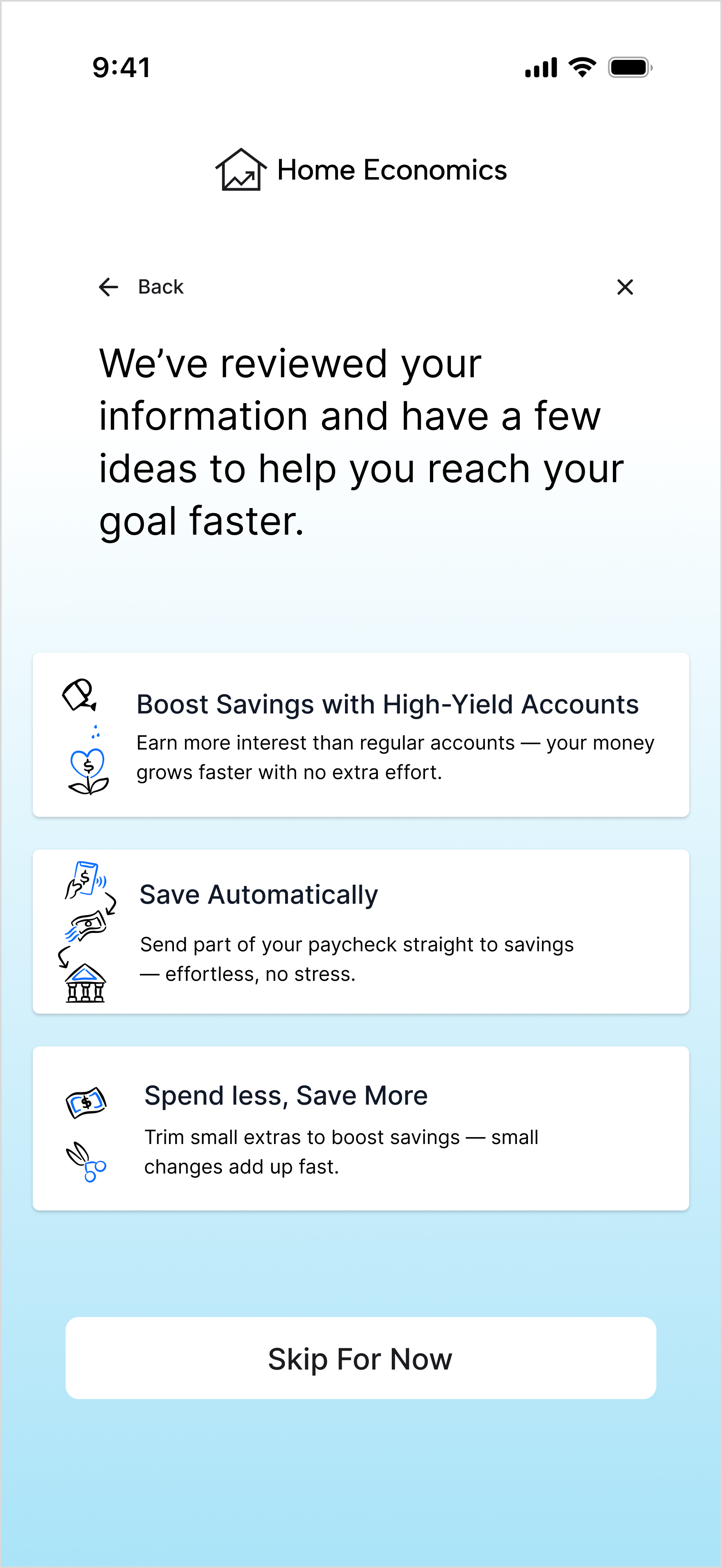
Goal Setting
Help users set financial goals and explore alternative savings strategies through AI suggestions.
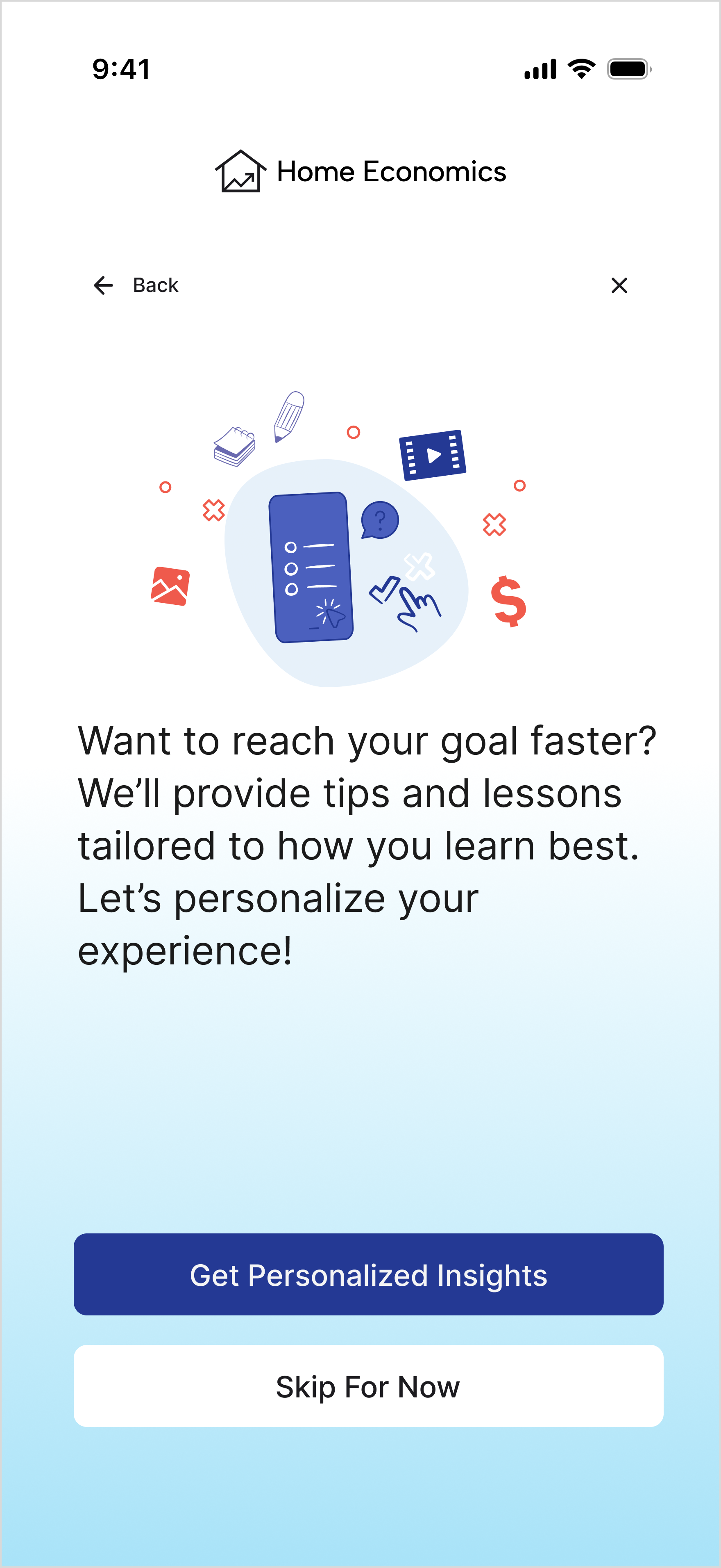
Learning Path
Customize educational content based on users’ goals, preferred learning style, and time availability.
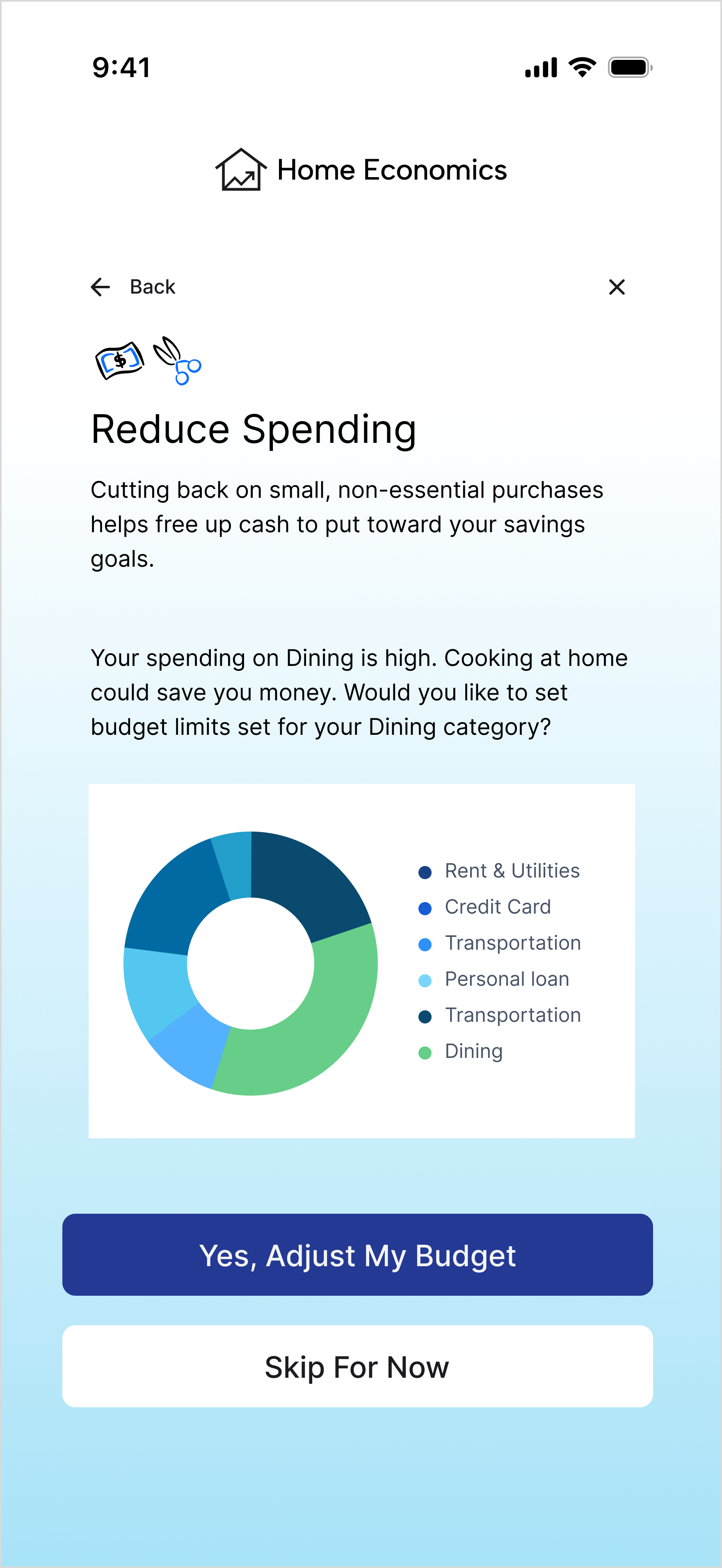
Budget & Finance
Monitor budgets and goals, provide alerts when overspending occurs, and offer actionable options to get back on track.
LOW- TO MID-FIDELITY WIREFRAMES
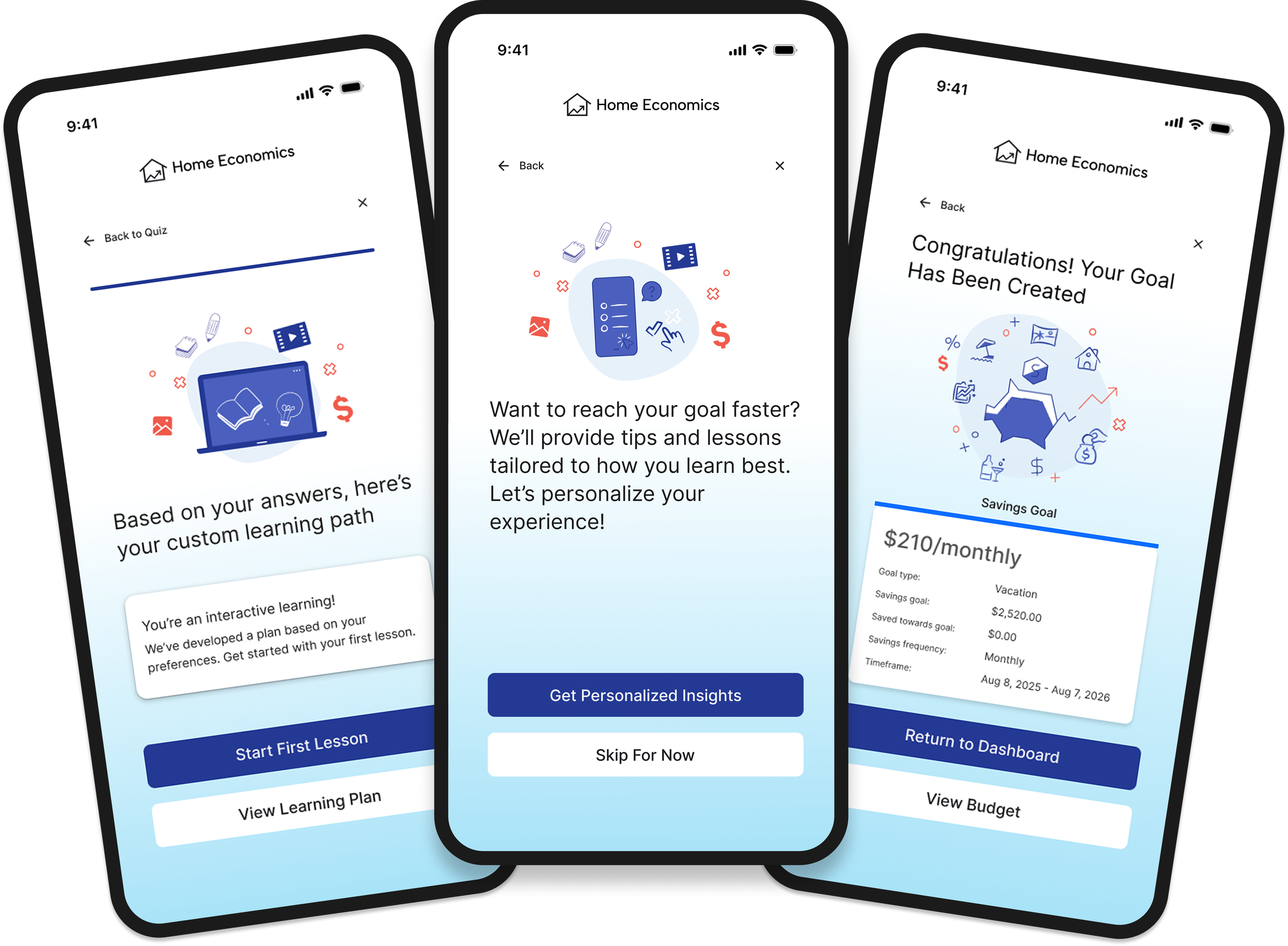
I began with low-fidelity wireframes, focusing on the goal creation screen. Through feedback from peers, I iterated on what questions to ask, how each flow should be, how to show the user their progress, and the final messaging.


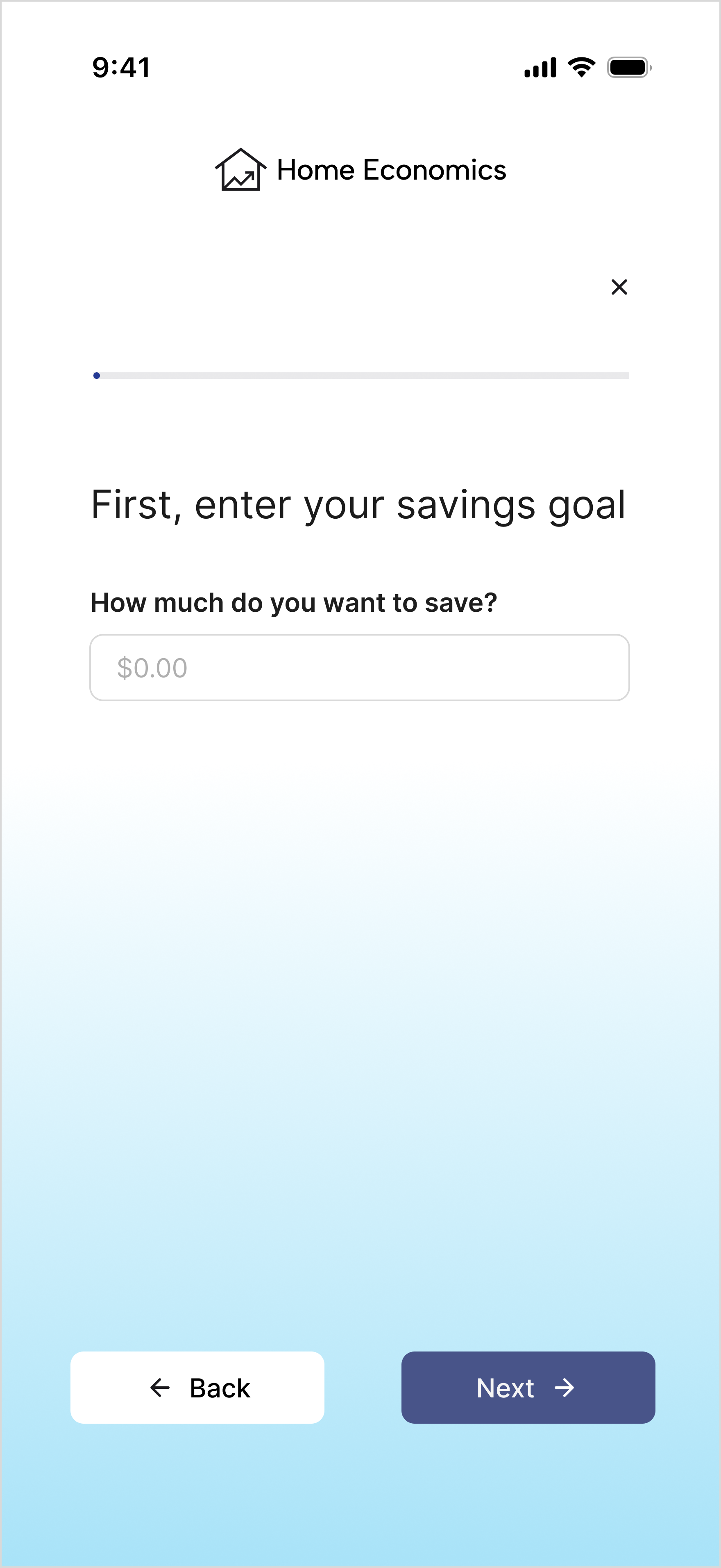
GOAL SETTING
First, I set out to understand the right questions to help a user determine a goal. After that, I determined the UI elements, and, per peer feedback, added illustrations to break up the text.
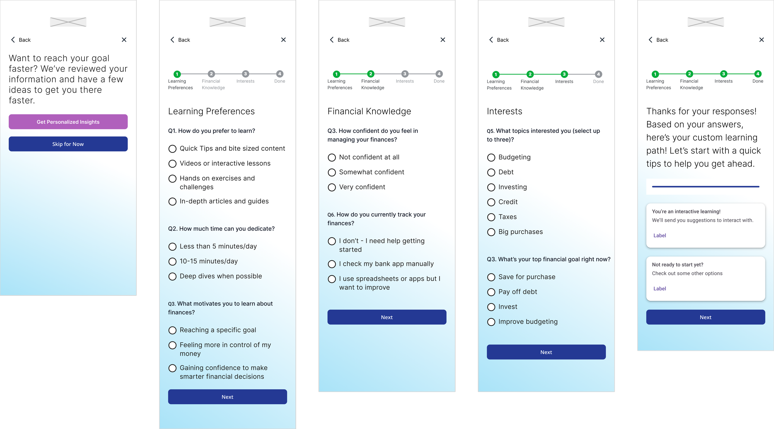

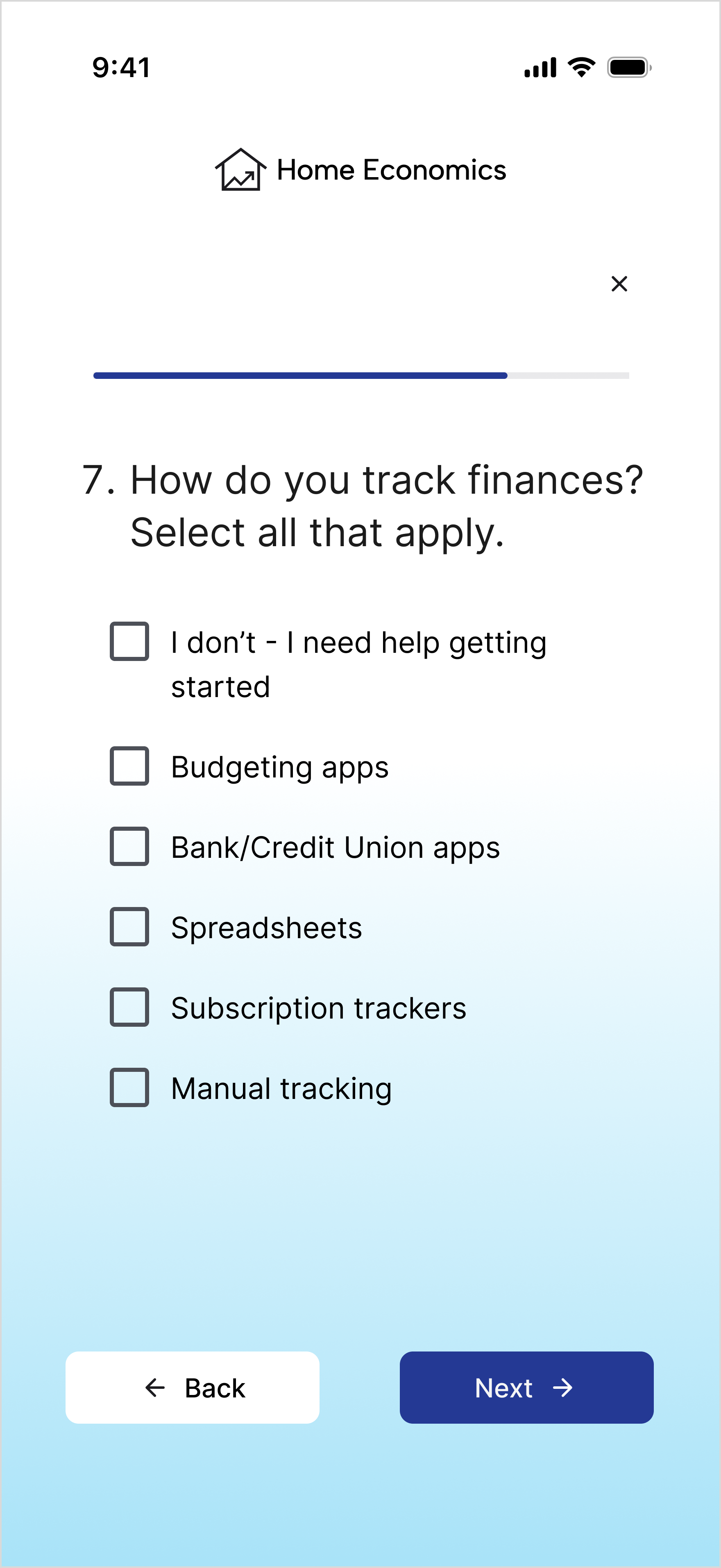
LEARNING QUIZ
Similar to goal setting, I first considered which questions to ask the user to make decision easy on them and UI elements, like a progress bar, to let them know how much time the quiz would take.

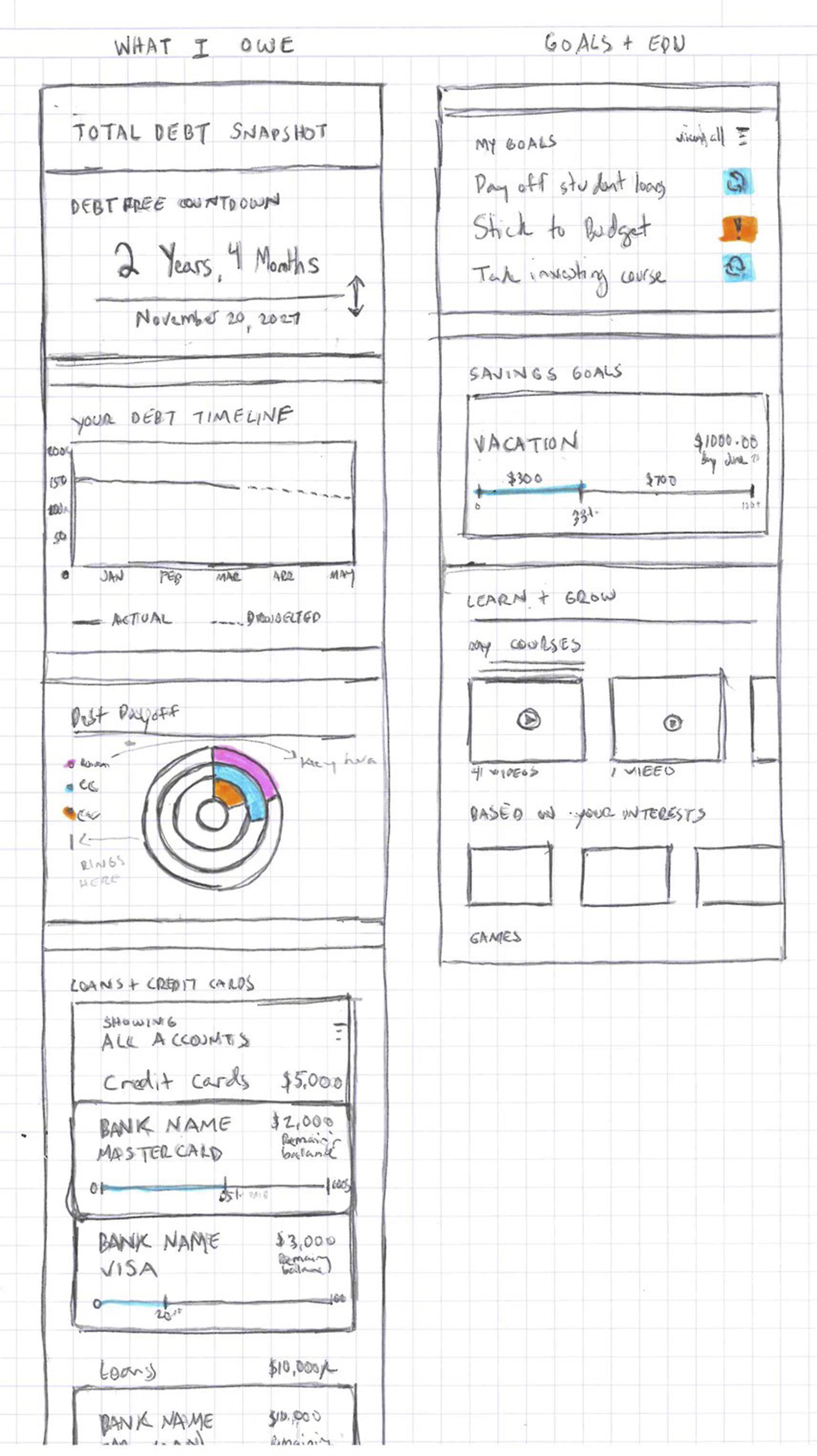

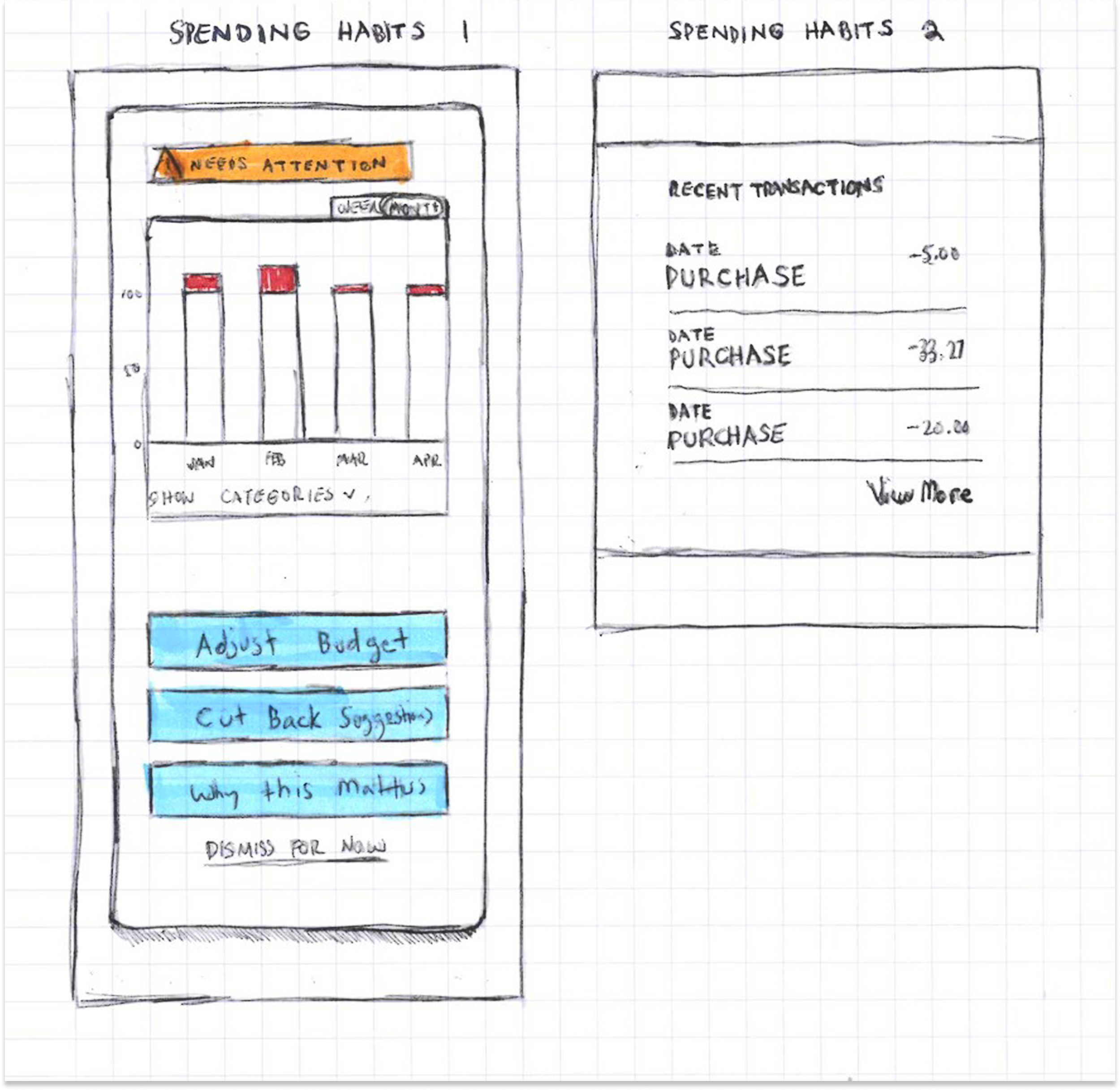
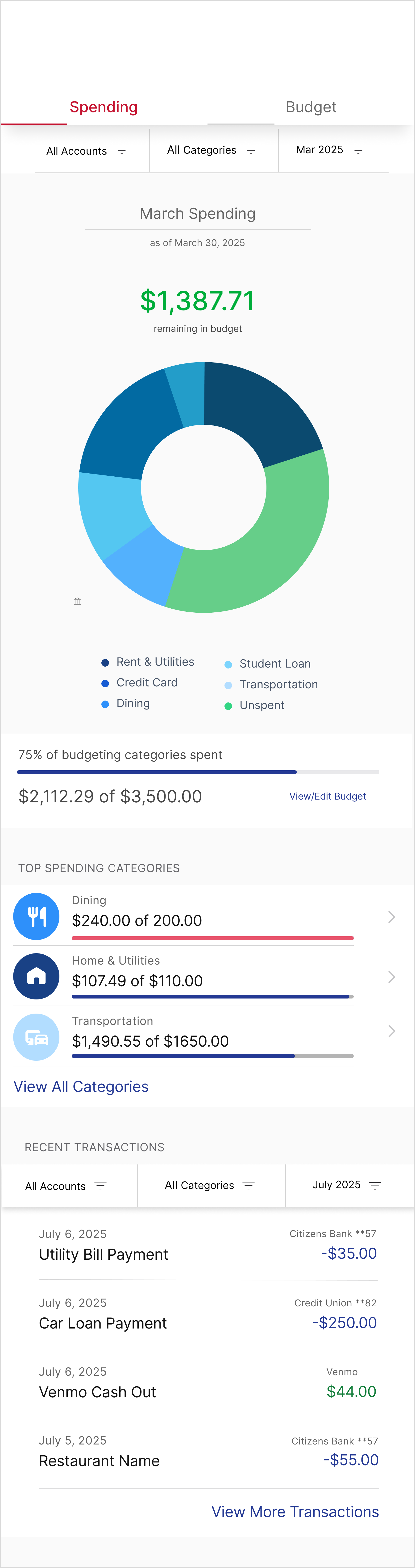
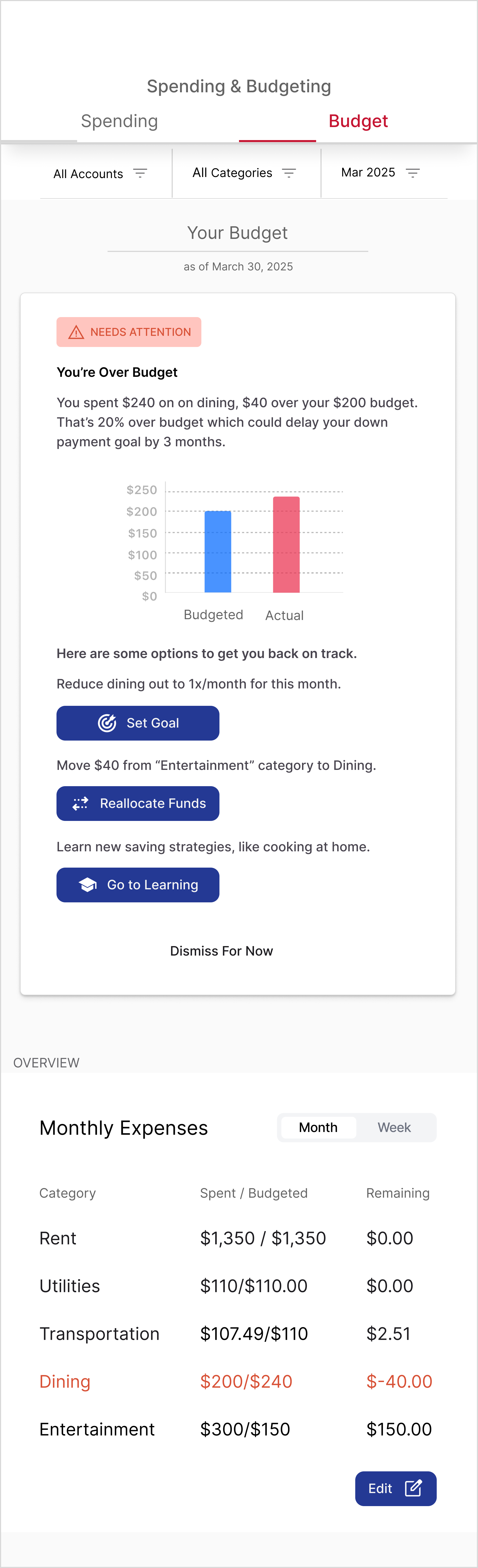
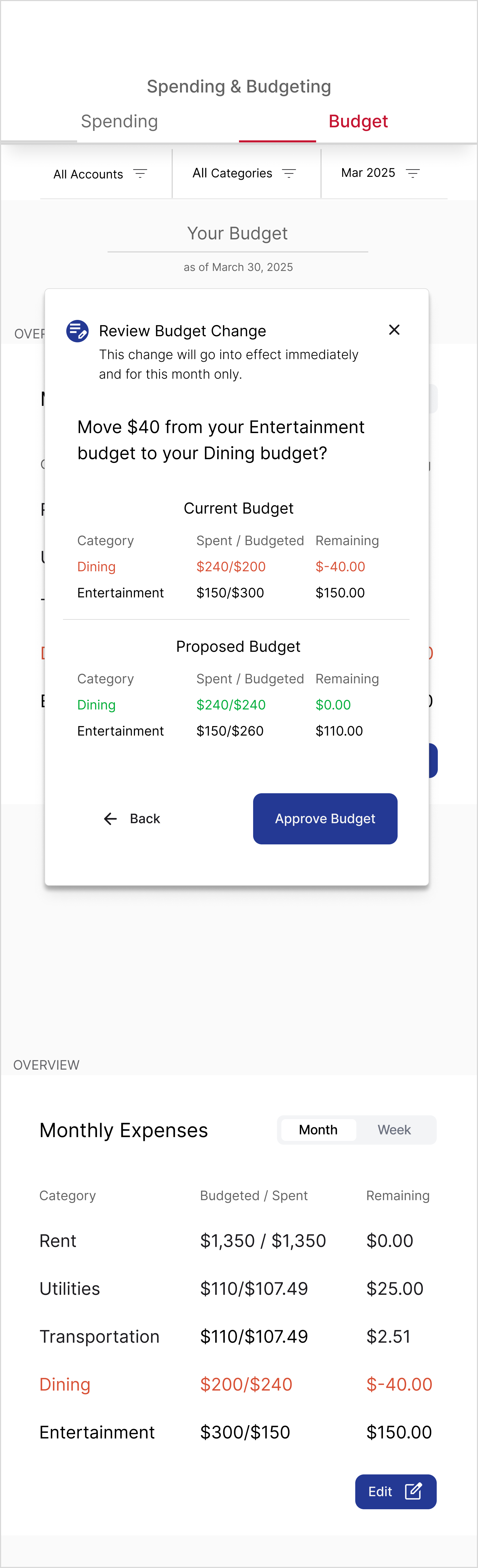
Budget Overage / Dashboard
This flow requires the user reset their budget based on insights into their account, but I also wanted to help the user understand through visual aids, like charts and graphs. I spent time viewing different sources and selected ones that best represented information to make it easily digestible.
BRANDING & UI
The UI design phase focused on translating research insights into a visually appealing, trustworthy, and accessible experience. Every element—color, typography, layout, and iconography—was carefully chosen to reinforce clarity, calm, and user confidence.


BRAND INTEGRATION
The color palette centers on blues, evoking calm, trust, stability, and professionalism. Typography was selected for readability and clarity, balancing numeric precision with approachable text for an organized, professional feel. Accessibility was prioritized through strong contrast between deep blue and white, large headers, and minimal on-screen text to reduce overwhelm.
The logo, “Home Economics,” blends personal and educational themes: a house shape containing a chart to symbolize financial growth and learning, reinforcing the product’s mission visually and conceptually.


UI PATTERNS
Interface patterns were designed to guide users step by step, keeping interactions calm, motivating, and easy to follow. Data is presented thoughtfully to promote clarity and proactive financial decisions, with clear visual hierarchy, selected item highlights, and nested content arranged in intuitive order. The overall design emphasizes personalization and progress, reinforcing user confidence and engagement throughout their financial journey.
TESTING + ITERATION
User testing was conducted to validate the prototype and ensure it met real user needs. By observing participants interact with key flows—learning style quiz, goal setting, and budget dashboard—I gathered actionable insights that guided iterative improvements and refined the user experience.
ITERATION APPROACH
Feedback was prioritized by urgency and impact. Changes that could quickly reduce confusion were implemented immediately, while mid-level and eventual adjustments were scheduled for later iterations. This approach ensured that user pain points were addressed efficiently while maintaining momentum in the design process.
Before
After


Goal Setting
Participants appreciated the clear flow for setting goals and the usefulness of AI-driven suggestions. Pain points included confusion around contribution timing, unclear progress tracking, and ambiguous action labels like “Set Goal” and “Save to Learn.” Users wanted more guidance, including automated paths to reach goals and clearer visual progress indicators.


After
Before
After
Before


Budget Overage / Dashboard
Pain points included hidden details within the budget page, unclear auto-updating, confusing buttons, and difficulty making quick adjustments. Participants wanted easy on-dashboard edits but I chose to focus on changes that would take little effort to implement but would have a big impact on the user’s experience.
Before
After


Before
After


Learning Style Quiz
Multiple-choice and single-choice were only clear to half of the participants. Some confusion also arose around the final screen call-to-action, unclear terminology like “subscription tracker,” and redundancy in a few questions.
Final Design Solution
The final solution brings together research, ideation, and iterative design into a cohesive, user-centered experience. It addresses the anxieties, confusion, and overwhelm millennials face around finances by providing clarity, guidance, and actionable tools that empower users to take control of their financial lives.
Goal Setting
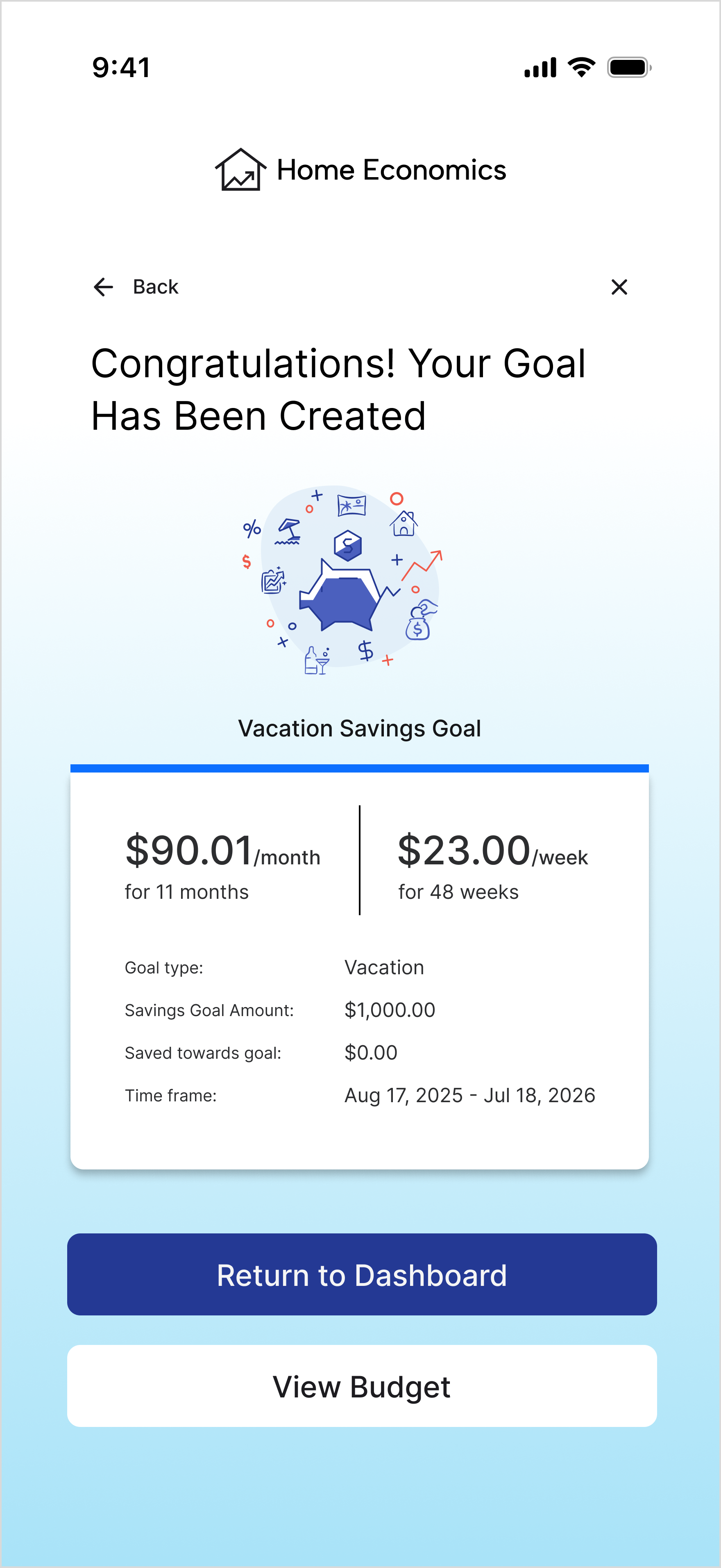
Users can set and track personalized goals with clear visual progress, AI-driven suggestions, and automated guidance. Goals are framed in intuitive, actionable steps rather than abstract percentages, helping users see exactly how to achieve their targets.
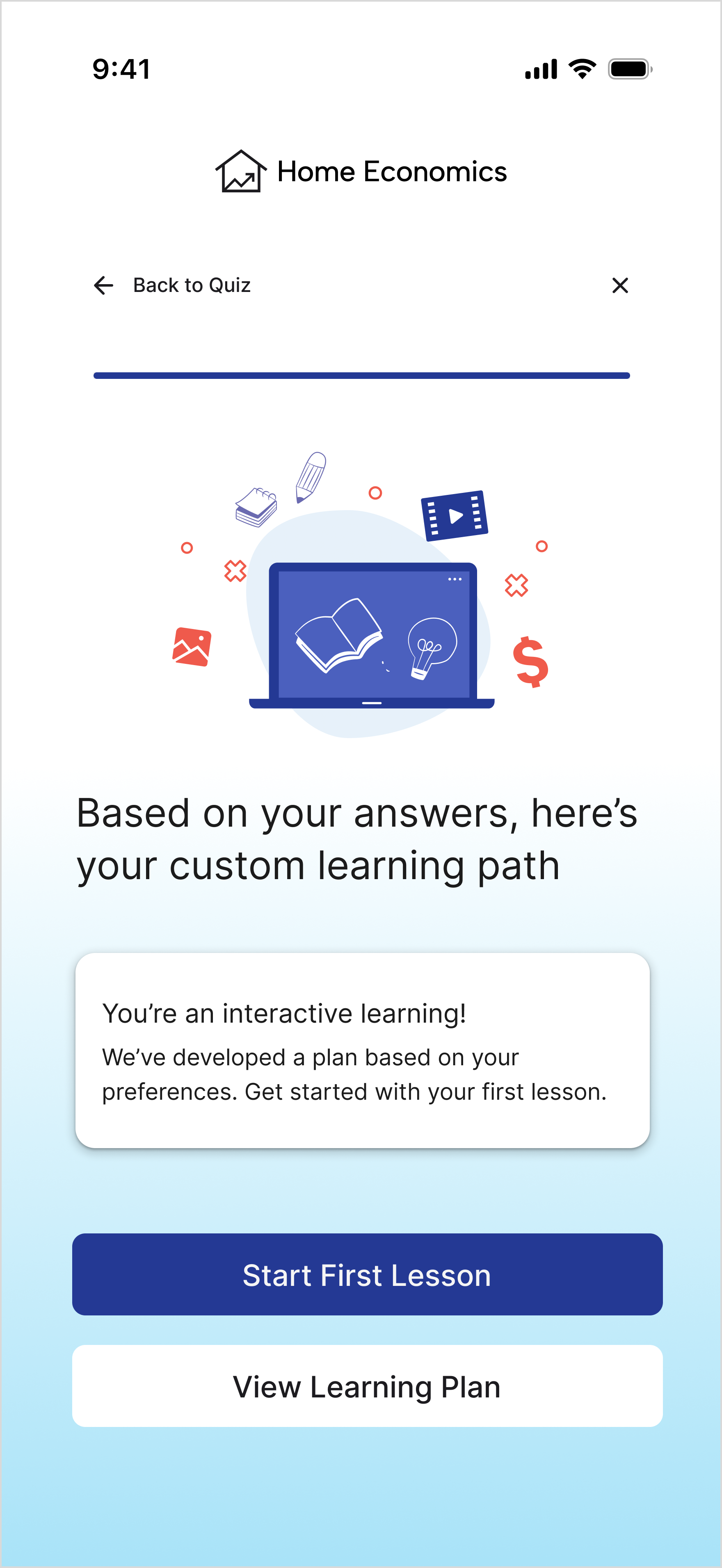
Learning Path
The app personalizes financial education based on user goals, preferred learning style, and available time. The learning experience is approachable, interactive, and broken into manageable steps to reduce overwhelm.
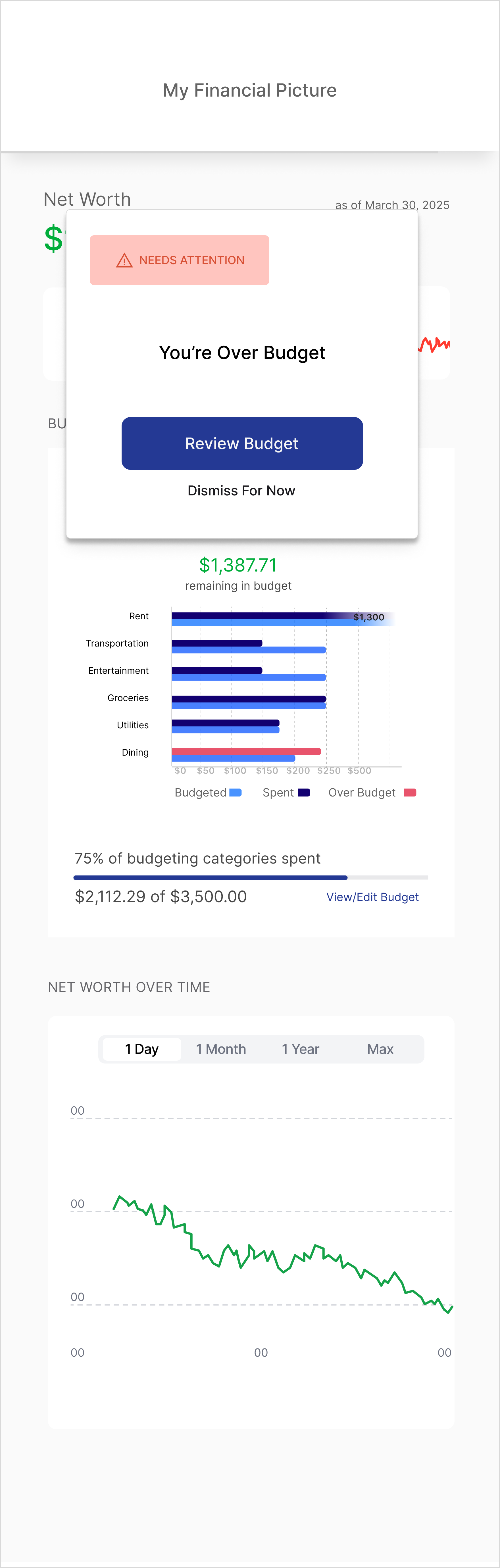
Budget & Dashboard
Users gain a holistic view of all accounts, with visual indicators like rings and progress bars to track spending. Manual adjustments via sliders, clear labels, and on-dashboard editing provide control and transparency. Alerts notify users of overages and actionable options help them stay on track.
Wrap Up & Reflection
This solution addresses the core research insights by reducing financial overwhelm through intuitive flows, simplified setup, and digestible learning, while building trust with clear language, transparent data visualization, and consistent branding. Personalized learning paths and AI-driven guidance bridge financial literacy gaps, transforming financial management into an experience that feels clear, approachable, and motivating. Early testing shows increased user confidence and engagement, confirming the design meets both user needs and business goals.
This project reinforced the importance of research-driven design in simplifying complex, emotional topics like personal finance. Developing multiple visualization approaches strengthened my ability to translate complexity into clarity, while building a robust component system improved efficiency and consistency for scalable features like learning paths. The work deepened my empathy, design rigor, and interest in further expanding the educational experience within the broader financial literacy landscape.