
Home Economics
The app that helps you reach your financial goals and grow your confidence

Role: UX researcher and designer
Time frame: 4 weeks
Field: FinTech + FinEd
Background
Millennials face many unique financial challenges.
Millennials, those born between 1981-1996, have less federal support than previous generations. They came of age during a financial crisis, which affected their job opportunities and perspective on financial institutions. New technology offers many resources but they lack the foundational knowledge to effectively use these tools.
Despite the importance of financial literacy, a significant portion of the U.S. millennial population, the largest generational group as of 2023, demonstrates inadequate financial knowledge. The 2018 TIAA Institute-GFLEC Personal Finance (P-Fin) Index revealed that while only 11% of millennials exhibited high financial literacy, as indicated by correctly answering over 75% of the index questions, a concerning 28% showed very low financial literacy, answering 25% or less of the questions correctly.
This disparity underscores the urgent need to improve financial education among millennials to ensure their ability to make informed financial decisions, thereby impacting both their personal finances and the broader U.S. economy.
The Problem
Millennials struggle with anxiety, distrust, and decision paralysis around money management, and need a clear, trustworthy, and flexible financial tool that is motivating, builds literacy and confidence, supports their goals, and reduces the overwhelm of planning for stability, experiences, and milestones like homeownership.
The Objective
Create a framework that meets a particular demographic's needs in increasing motivation, knowledge, and competence around personal finance.
Uncover the user's emotional and psychological attitudes towards financial literacy.

Understand what motivates users to increase their financial literacy.

Determine pain points for users interested in increasing their financial literacy.

Research
Competitive Analysis
I selected You Need A Budget (YNAB), Paven, and Betterment), three finance apps that help their users budget and provide personalized financial guidance. I compared their unique value, advantages and disadvantages. From there, I thought through their similarities, differences, opportunities, and summed it up in key learnings.
“Make Every Dollar Count”
Similarities

Key Learnings


“Get the personalized guidance you need to reach your goals at the pace that is right for you.”
Differences
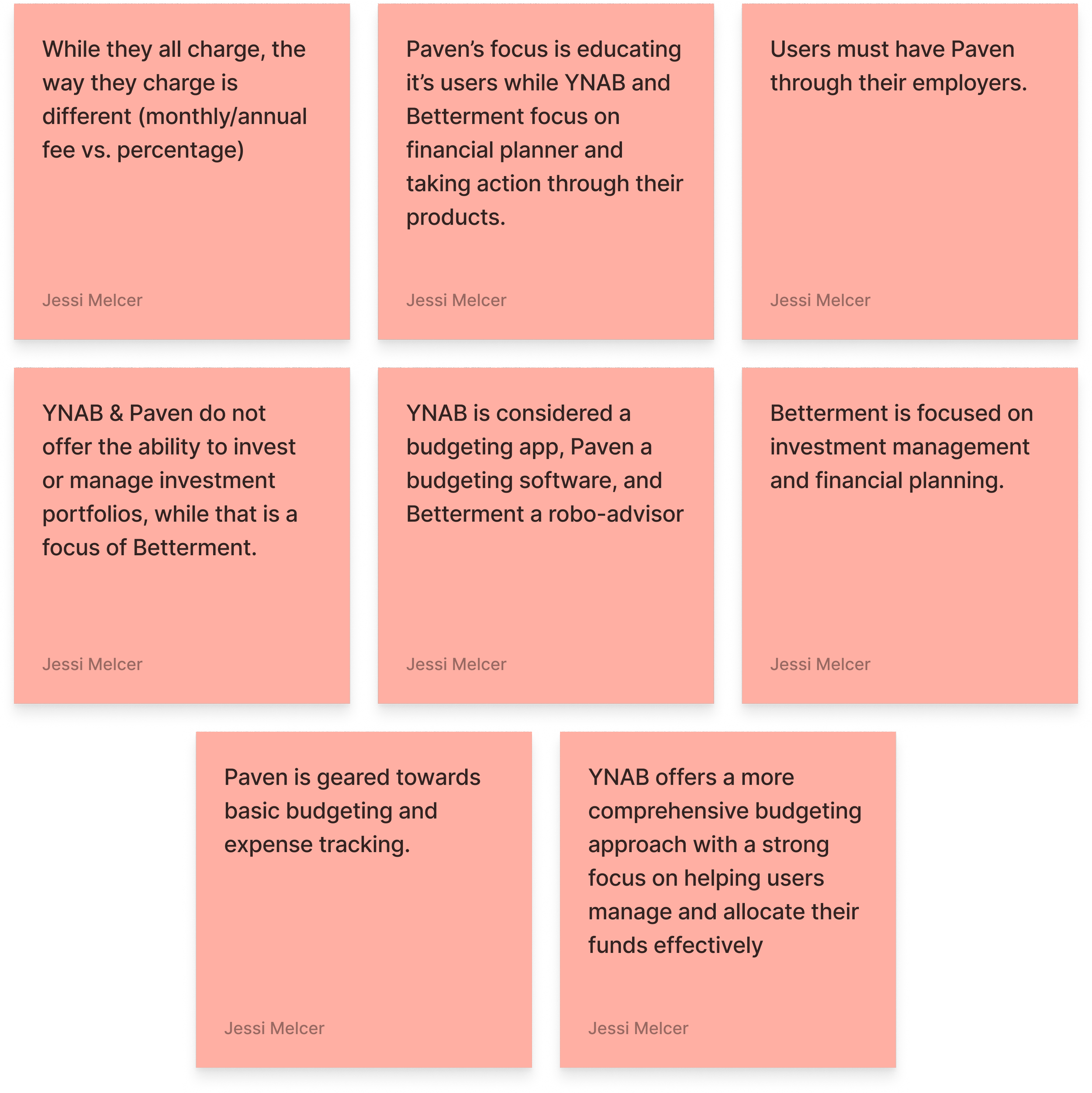
Opportunities
“Our mission is to provide the best possible solution to the question, ‘What should I do with my money?’”

User Interviews
I interviewed six participants who were born between 1984-1995 & asked the below questions.
Demographic information (birth year, marital status, salary range)
Can you tell me about your current relationship with money and financial decisions?
How do you feel about managing your finances on more of a day to day basis
Describe a recent experience that made you feel confident or anxious about your financial situation?
Could you talk a little bit more about how you feel, what emotions come to mind when you think about long term financial planning?
How do you typically approach financial decisions when you're faced with uncertainty?
Can you share a time when a financial choice had a significant impact on your life? How did it make you feel?
What does financial security mean to you?
How important is financial literacy in your life?
Have there been any cultural or familial influences that have shaped your views on money and planning
Do you discuss financial matters with friends or family? How does that influence your decisions?
Can you tell me about your goals in life related to family, friends, career, free time, hobbies, etc.?
How do short term and long term financial goals and how do they impact your daily life?
How do you think improving your financial literacy could could benefit you?
What are the biggest challenges you face when it comes to understanding or managing your finances,
Can you recall when you felt overwhelmed or confused by financial information
How do you prefer to learn about financial topics, for example, through apps, workshops, one on one sessions?
What motivates you to engage with financial education, advice or seek it out?
is there anything you wish you had learned earlier about managing money?
how do you think your past experiences have shaped your current approach to financial decision making?
User Interviews
Key Findings
“I don't want to spend much of my personal time on[financial] jargon.”
Through interviews with 6 participants, it became clear that money is deeply emotional for users. Many described feeling anxious, guilty, or even panicked when dealing with finances—especially around credit cards, taxes, and long-term planning. These emotions often led to avoidance, leaving them stuck in cycles of stress and inaction.
A strong sense of distrust surfaced across nearly every conversation. Users were skeptical of banks, advisors, and even financial apps. For many, this mistrust traces back to the 2008 financial crisis or personal experiences with scams and hidden fees. They prefer to feel in control, but often lack the tools or confidence to get there.
The financial literacy gap was another major barrier. Users struggled with jargon and complex terms, like “CDs” or “tax deductions,” that made them feel excluded from the world of finance. They wanted plain-language guidance—something that would meet them where they are without judgment.
Existing tools weren’t meeting those needs. Apps like Mint or YNAB felt too rigid or overly complex, making users feel more frustrated than empowered. What they really wanted was a holistic, supportive tool that could grow with them.
A surprising emotional trigger was turning 30. Many users saw this milestone as a wake-up call—a moment to get serious about finances and stop feeling “behind” compared to friends. Family and cultural expectations also played a role, shaping beliefs about saving, success, and homeownership.
Motivations
“I don't dream about designer bags but I would like to afford experiences and a comfortable living situation.”
Despite their frustrations, users were highly motivated to improve. Most wanted financial independence—freedom from debt and the ability to make choices without stress. Homeownership represented stability and success, though many saw it as a distant dream.
Many also valued experiences over possessions, choosing travel, time with friends, and personal growth over buying things. Their motivation wasn’t just about money—it was about building a life that felt secure and fulfilling.
At the same time, users expressed a strong desire to learn and grow. They wanted to build financial confidence, not just manage budgets. And behind it all was a shared goal: to feel prepared for the unexpected, whether that meant a job loss, emergency expense, or shift in life circumstances.
Pain Points
“I don’t spend money out of fear.”
For most users, financial planning felt overwhelming. The combination of complex information and emotional pressure made it hard to even get started. Many described opening a finance app, feeling confused, and closing it again within minutes.
This confusion was amplified by distrust—not knowing who or what to believe. Even well-meaning offers like “zero-interest” loans triggered skepticism. Decision-making became paralyzing, leading to procrastination and avoidance.
Taxes were another major stressor, often described as a yearly nightmare. And as users compared themselves to peers buying homes or investing, they felt mounting pressure to “catch up.” Finally, the cost and inaccessibility of financial advisors left many feeling like they had no reliable source of guidance.
Personas
Whether impulsive spender or cautious saver, users like Sarah and Jenna want tools that make financial growth feel clear, approachable, and achievable.


Though their habits differ, both share the same goal—to replace confusion and self-doubt with confidence, control, and peace of mind in their financial lives.
The Refined Problem
Millennials face overwhelming anxiety when it comes to managing money—particularly around credit cards, taxes, and long-term planning—which often leads to guilt, avoidance, and procrastination. Many lack trust in banks, advisors, and even financial apps, shaped by experiences like the 2008 recession, fraud, and confusing jargon that creates a persistent financial literacy gap.
At a turning point around age 30, users feel behind compared to peers in reaching cultural milestones such as homeownership, while also prioritizing experiences like travel and lifestyle. They’re motivated by a strong desire for financial independence, security, and preparedness for emergencies, yet existing tools (Mint, YNAB, Acorns) feel rigid, complicated, or incomplete.
This leaves users unmotivated and stuck in decision paralysis —wanting clear, plain-language guidance and holistic, flexible support that feels trustworthy, accessible, and tailored to their goals. Without such a solution, financial planning remains emotionally draining, inaccessible, and out of sync with their aspirations.
Research Synthesis
Business Goals
Help users understand their finances better by providing big picture
How Might We?
How might we use visuals to show millennials how their finances work, while increasing their knowledge?
How can we engage millennials about their finances so they feel motivated and excited to increase their financial literacy?

Prioritization & Road mapping
Feature Road Map + Product Requirements
Account Creation
User registration, sign in, and account page so the user can access all their relevant and specific data.
Financial Dashboard
Account Aggregation: Connects to all financial accounts, including bank accounts, credit cards, loans, mortgages, and investment accounts, for a comprehensive financial overview.
Goal Setting
Allows users to set and track goals like buying a home, paying off debt, or saving for a large purchase.
Transaction Categorization
Automatically categorizes transactions to help users understand where their money goes.
Financial Education
Access to an extensive library of articles, videos, and tools on topics like budgeting, investing, negotiating salary, and more.
Net Worth Tracker
Reliable measure of financial wellness.
Budgeting
Customizable Budgets: Users can set up budgets tailored to specific spending categories, such as groceries, dining, entertainment, and more.
Tracking
1. Progress Tracking: displays visual progress toward financial milestones. 2. Cash Flow Tracking: visualizes income and expenses to monitor spending habits and ensure budgets are on track.
Financial Guidance
AI generated insights and suggestions for maintaining and reaching goals.

Secondary research, competitor analysis
Tool for generating a user base and loyalty
User interviews + competitor analysis
Users want to be able to visualize their finances and get a big picture.
User interviews
Users need help setting and maintaining financial goals so they can achieve personal goals.
User interviews + competitor analysis
Makes the data collection quick and easy so uses can begin meeting their goals sooner.
Secondary research, competitor analysis
Helps user learn on their own time and personal learning style.
User interviews + competitor analysis:
Users want to see their overall financial health
User interviews + competitor analysis
Users expressed using many tools for budgeting. Having budgeting in one place with all other tools helps them keep focus and have holistic view.
User interviews + competitor analysis
Users want to be able to visualize their finances and it will encourage them to continue saving to meet their goals.
User interviews + competitor analysis On-demand guidance for users who don't want to commit/pay for a financial planner. Provides tips on cutting costs and improving financial health.
Site Map
In this sitemap (partial image below), the user would navigate to the key features through a hamburger menu. Once I began sketching, I realized that the features should be on a bottom navigation bar so they weren’t hidden within a hamburger menu and the user could easily swap between screens.

Task Flow
I created three task flows: Account Set Up, Connect Accounts, and Goals (not shown). Later in this case study, you will see that I sketched and created low-fidelity wireframes for the Account Set Up & Connect Accounts flows. After getting feedback, I decided to not move forward with these two features and develop others that would be more impactful. I kept Goals as a feature.

Account Set Up
Account Set Up wasn’t a compelling feature to further develop into higher fidelities.

Connect Accounts
Third party apps like Square do a fine job at connecting user banking accounts so there wasn’t a need at this stage to improve upon that feature.
Design Goals

Build Trust Through Transparency
Create an experience that feels safe, personal, and authentic—using clear language, supportive tone, and human-centered visuals to help users trust the app and their own financial decisions.
Make Financial Learning Feel Effortless
Simplify complex financial topics through visuals, micro-interactions, and plain-language explanations that turn abstract concepts into something users can see and understand.
Motivate Without Shame
Encourage consistent engagement through positive reinforcement, progress tracking, and gentle nudges that build confidence rather than guilt.
Support Holistic Financial Wellness
Go beyond budgeting—help users connect short-term actions to long-term goals like travel, savings, or homeownership, reflecting both practicality and aspiration.
Design for Flexibility and Ease
Enable users to engage at their own pace and comfort level, reducing overwhelm with an intuitive, minimal interface and personalized guidance.
Success Metrics
Though this is a fictitious product created for a school project, I would still use these attributes to gauge the users’ experience. While I tested my prototypes, I kept these goals in mind as I received feedback from the participants.
Engagement
Increase in repeat app sessions or time spent completing financial learning tasks.
Confidence
Users report higher confidence in understanding or managing finances after onboarding or completing learning modules (measured via in-app surveys or usability testing).
Trust
Positive feedback around clarity, tone, and sense of security when interacting with financial data or advice.
Action
Increase in users setting or tracking personal goals (e.g., savings, debt payoff, emergency fund).
Retention
Reduction in user drop-off after onboarding, indicating sustained motivation and emotional comfort with the product.
Ideation
These brainstorming insights laid the foundation for focused solutions, highlighting where simplicity, guidance, and flexibility could empower users to take their first confident steps toward financial wellness.
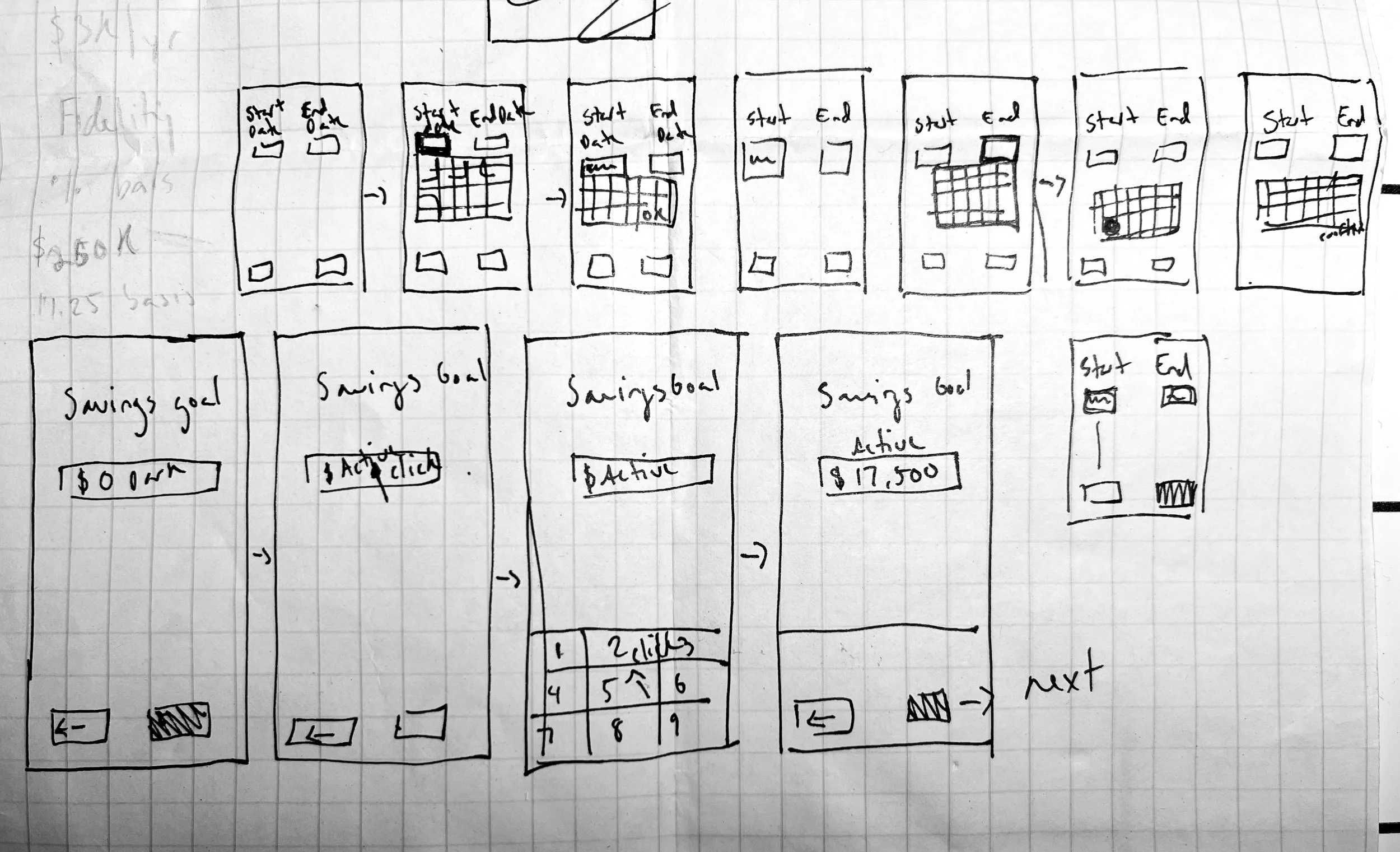
I explored ways for users to upload their bank account and financial information quickly without being bogged down by data entry. I sketched & low-fidelity wired-frame flow where the user would scan their debit/credit card to retrieve their account information. After receiving feedback, I ultimately set aside custom upload options since third-party solutions like Square already worked well.

Sketch for debit/credit card scan & upload

Sketch for debit/credit card scan with option to bypass and upload through banking credentials.
Wireframing + Prototyping
From sketches to interactive screens, I translated ideas into structured flows, iterating on visuals, language, and features to create a clear, supportive, and engaging user experience.
For the MVP, I narrowed features to three core areas:
Goal Setting
Help users set financial goals and explore alternative savings strategies through AI suggestions.
Learning Path
Customize educational content based on users’ goals, preferred learning style, and time availability.
Budget & Finance
Monitor budgets and goals, provide alerts when overspending occurs, and offer actionable options to get back on track.

Low- to Mid-Fidelity Wireframes
I began with low-fidelity wireframes, focusing on the goal creation screen. Through feedback from peers, I iterated on what questions to ask, how each flow should be, how to show the user their progress, and the final messaging.
1. First, I sketched out the flow of the quiz.
2. I moved to Figma once I had a rough sense of the questions to ask. Feedback helped identify questions to stick with, which flows worked best and clarified how to visually represent data in the most helpful way.
3. Moving to mid-fidelity, I refined language, question flow, colors, and text.
4. I added illustrations to enhance visual appeal and break up dense information.
1.
2.
3.


4.

In the high-fidelity stage, testing led to targeted refinements:
Goal Setting
Help users set financial goals and explore alternative savings strategies through AI suggestions.

High-Fidelity Wireframes
Learning Path
Customize educational content based on users’ goals, preferred learning style, and time availability.

Budget & Finance
Monitor budgets and goals, provide alerts when overspending occurs, and offer actionable options to get back on track.

Iterative wireframing and prototyping turned concepts into tangible experiences, refining flows, visuals, and interactions to ensure clarity, engagement, and alignment with user goals.
UI
The UI design phase focused on translating research insights into a visually appealing, trustworthy, and accessible experience. Every element—color, typography, layout, and iconography—was carefully chosen to reinforce clarity, calm, and user confidence.
Brand Integration
The color palette centers on blues, evoking calm, trust, stability, and professionalism. Typography was selected for readability and clarity, balancing numeric precision with approachable text for an organized, professional feel. Accessibility was prioritized through strong contrast between deep blue and white, large headers, and minimal on-screen text to reduce overwhelm.
The logo, “Home Economics,” blends personal and educational themes: a house shape containing a chart to symbolize financial growth and learning, reinforcing the product’s mission visually and conceptually.


UI Patterns
Interface patterns were designed to guide users step by step, keeping interactions calm, motivating, and easy to follow. Data is presented thoughtfully to promote clarity and proactive financial decisions, with clear visual hierarchy, selected item highlights, and nested content arranged in intuitive order. The overall design emphasizes personalization and progress, reinforcing user confidence and engagement throughout their financial journey.


Testing + Iteration
User testing was conducted to validate the prototype and ensure it met real user needs. By observing participants interact with key flows—learning style quiz, goal setting, and budget dashboard—I gathered actionable insights that guided iterative improvements and refined the user experience.
Iteration Approach
Feedback was prioritized by urgency and impact. Changes that could quickly reduce confusion were implemented immediately, while mid-level and eventual adjustments were scheduled for later iterations. This approach ensured that user pain points were addressed efficiently while maintaining momentum in the design process.
Through iterative testing, I was able to validate key design decisions, uncover usability gaps, and refine the product to better align with user needs. Each round of feedback brought the prototype closer to an intuitive, engaging, and supportive financial experience.
Goal Setting
Participants appreciated the clear flow for setting goals and the usefulness of AI-driven suggestions. Pain points included confusion around contribution timing, unclear progress tracking, and ambiguous action labels like “Set Goal” and “Save to Learn.” Users wanted more guidance, including automated paths to reach goals and clearer visual progress indicators.
Before

After

Changes implemented: Contribution framing was updated to monthly amounts.

After

Changes implemented: Sized the warning screen down so users could see all the options available without scrolling.
Before

After


Changes implemented: Laid out the changes being proposed and made it clear to users that their budget would automatically adjust. Removed confusing CTA on the confirmation screen.
Budget Overage / Dashboard
Testers valued the debt overview, visual progress indicators, and a centralized view of accounts. Pain points included hidden details within the budget page, unclear auto-updating, confusing buttons, and difficulty making quick adjustments. Participants wanted easy on-dashboard edits but I chose to focus on changes that would take little effort to implement but would have a big impact on the user’s experience.
Before
Learning Style Quiz
Testers found the quiz easy to use, appreciating the short, clear introduction and the ability to select answers by clicking anywhere on a line. Multiple-choice and single-choice were only clear to half of the participants. Some confusion also arose around the final screen call-to-action, unclear terminology like “subscription tracker,” and redundancy in a few questions. One tester also suggested adding an “Other” option and capturing demographic and financial context early in onboarding to personalize content.

Changes implemented: Add language to make it clear which questions were multiple choice vs. one choice.
Before


After

Changes implemented: Final CTA updated from “Get Started” to “Start First Lesson”.
Before
After
Final Design Solution
The final solution brings together research, ideation, and iterative design into a cohesive, user-centered experience. It addresses the anxieties, confusion, and overwhelm millennials face around finances by providing clarity, guidance, and actionable tools that empower users to take control of their financial lives.
Final Design Highlights
Goal Setting
Users can set and track personalized goals with clear visual progress, AI-driven suggestions, and automated guidance. Goals are framed in intuitive, actionable steps rather than abstract percentages, helping users see exactly how to achieve their targets.
Learning Path
The app personalizes financial education based on user goals, preferred learning style, and available time. The learning experience is approachable, interactive, and broken into manageable steps to reduce overwhelm.
Budget & Dashboard
Users gain a holistic view of all accounts, with visual indicators like rings and progress bars to track spending. Manual adjustments via sliders, clear labels, and on-dashboard editing provide control and transparency. Alerts notify users of overages and actionable options help them stay on track.
How It Solves the Original Problem
The final design directly addresses the challenges identified in research:
Reduces overwhelm through intuitive flows, simplified setup, and digestible learning steps.
Builds trust with clear language, transparent data visualization, and consistent, professional branding.
Bridges the financial literacy gap with personalized learning paths and AI-driven guidance.
The solution transforms financial management from stressful and confusing into clear, approachable, and motivating. Early testing indicates that users feel more confident, engaged, and capable of taking meaningful actions toward their financial goals, demonstrating that the design effectively meets both user needs and business objectives.
Reflection
Reflecting on this project highlighted the complexity of personal finance and the importance of thoughtful, research-driven design. It reinforced how user-centered approaches can simplify overwhelming topics and empower people to take meaningful action.
Lessons Learned
Taking time to understand financial concepts not only deepened my empathy for users but also strengthened my confidence in translating complex information into clear, actionable experiences. For example, I wanted to help my users visualize their finances in multiple ways. I spent time developing charts and graphs to help them understand their financial progress and proactively show anticipated progress.
I learned the value of creating a robust library of design components, variables, and instances—allowing me to prototype efficiently and maintain consistency, especially for features like multiple-choice learning paths. I spent hours on YouTube trying to learn the best process for these features!
While I gained a solid foundation in both financial literacy and design workflows, I recognize there is always more to explore, particularly in expanding the educational feature and understanding the landscape of financial education tools.
This project underscored the ongoing balance between learning, designing, and iterating. It reaffirmed that thoughtful preparation, curiosity, and adaptability are key to creating user-centered solutions—and that every project offers opportunities to grow both as a designer and as a learner.