
Team Thrive Athletics Responsive Website Redesign
A website and accompanying app where future clients can learn more about the coaches and and sign up for fitness and nutrition coaching.
Stakeholders: Team Thrive Athletics
Role: UX/UI Design & Research, Business Advisor/Strategy Consultant, Wix Website Designer, Content Writer
Tools: Paper and pencil, Figma, Wix, Canva, Adobe Photoshop
Team members: Me
Project length: 1 year
Methods used: Contextual interviews, competitive analysis, empathy map, affinity map, personas, interviews, UX audit, sketches
Completed: 2024


Background
Team Thrive Athletics (TTA), led by coaches Kristin and Emily, specializes in competitive bodybuilding and physique transformations. They enhance performance through personalized training and nutrition coaching, focusing on holistic lifestyle changes. By offering virtual coaching via their team app, they support clients in overcoming challenges and foster a community of fellow TTA athletes.
Problem
TTA, a small business initially relying on word of mouth, found their website lacking clear information about their identity, services, and uniqueness. Specifically, they wanted to make it clear that they offer strength training along with coaching for competitive bodybuilders. TTA realized they were fielding a lot of questions from new users (potential clients) who didn’t quite understand who they are or what they did. It became evident that their outdated website needed a refresh to better serve and inform new clients.

Coach Kristin
“The people inside our bubble understand what me and [Coach] Kristin do. [Our] website is just a formality.
But our business is continually growing. With that we’re reaching more people outside of our little bubble.
Those people are reaching our website and are like ‘I don’t actually understand this.’
Now [our reach] is wider; they don’t know Kristin and me, and they’re visiting our website first, and that is where the disconnect is occurring.”
Design Objective & Goals
Design goal 1
Understand how the product works and how it’s currently used by the user.
Design objective 1
Observe user while they work with the product.
Design goal 2
Define the problem as it relates to the client’s business goals.
Design objective 2
Perform a competitive analysis, a contextual observation, a task analysis, and user flows to understand what opportunities there are for the business and the best path to complete the users tasks.
Design goal 3
Deliver a high-fidelity prototype to client.
Design objective
Create low- mid- and high-fidelity mockups based on task analysis and user journey map and prototype the users journey.

Learnings
Research
Competitive Analysis
The stakeholders shared two of their competitors, Team LoCo Fit & Transformation Pro Ash. Along with TTA, I compared their unique business propositions, advantages, and disadvantages, which I distilled into opportunities for TTA.


Transformation Pro Ash
Opportunities

Research
Contextual Interviews + UX Audit
The stakeholders existing website was the one in question that needed help. I had 4 women interested in fitness, ranging from mid-thirties to mid-fifties, (their target client), review the current website and provide feedback.
Research Synthesis
Affinity Map
The feedback from the UX Audit provided the content for the affinity map. Below are the key findings and paint points from the audit.
Users found website design overwhelming, intense, confusing, discouraging. Users were intimidated by the first images of the coaches in the hero section.
“I feel like just that the first top part is a lot...at first sight.”

Working out is personal and vulnerable. Users want to connect with their coach and be part of a community.
“I’m a really social person and I love that there’s interaction. I feel if you have a personal connection in some way to working out...it’s important to me.”
Most of the language and visuals are geared towards competitive bodybuilding, not general strength training. It was unclear to the interview participants what services the coaches offered and who they were for.
“I’d say the homepage should be reworded because it only applies to bodybuilders right now.”
Most interviewees said they wanted to see the coaches in action. One said she’d like a video on the homepage, where others said they’d follow them on Instagram.
“The website is not pulling me in to think ‘oh man, this chick’s going to be a gnarly coach.’”
Users want to know more about the coaches: who are they, what are their qualifications and methods, what do they look like when they are training clients?
“When I go to fitness websites, I want to know what’s in store for me first. What is their style, breakdown, methodology?”
Pricing, services, location, methods were all unclear to users.
“[I’d want to know up front they’e virtual. I’d feel a little cheated if I looked through all of their information and it turns out they couldn't train me…”


Research
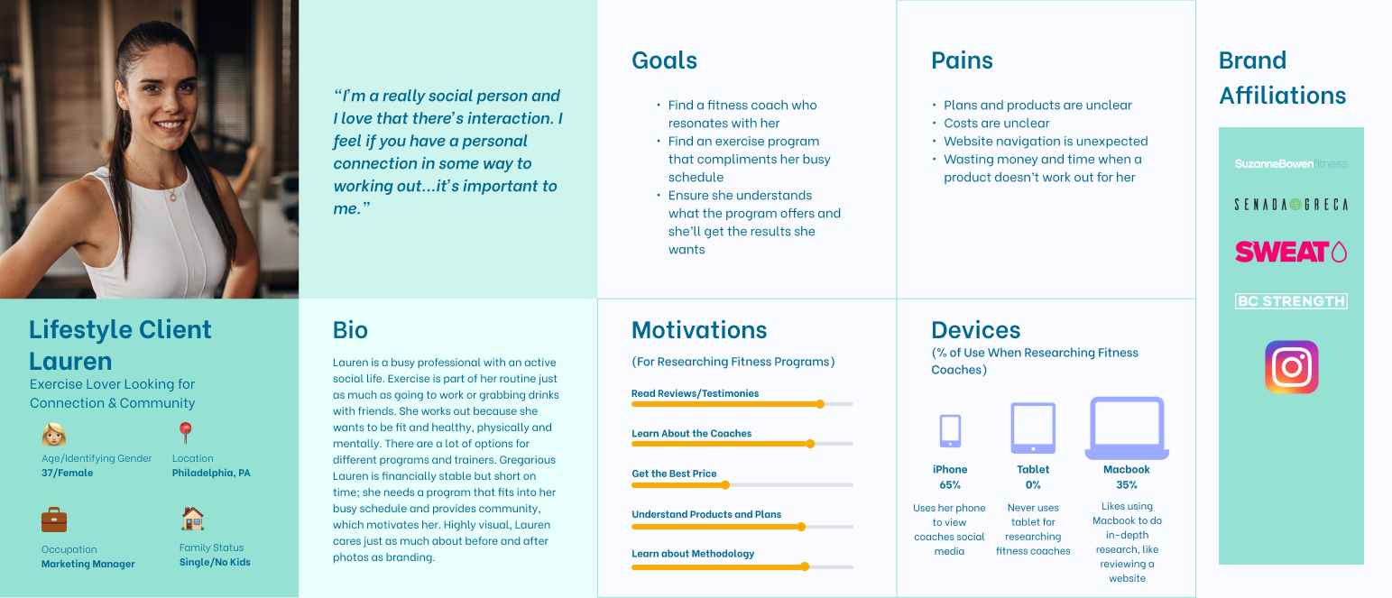
Persona
I started with this persona, based on TTA’s ideal client when I started with them. By the end, and after attending some business marketing classes, they determined their ideal client was someone who was interested in being coached for competitive bodybuilding. They went from a team of three coaches to two, and eventually narrowed down their programming to just bodybuilding.
Research Synthesis
Empathy Map
Based on the responses during the UX audit, it became clear that selecting a fitness program is deeply personal and users want to feel connected and safe to be vulnerable with their trainer. I wanted to delve deeper into my users emotions and behaviors. An empathy map would provide another avenue to picture my users feelings.
Refined Problem Statement
The business’ products (personal training/coaching) are unclear including their methodology, format, location, and pricing. The website's visuals are confusing and unappealing to users, and they don’t know where to find necessary information, which discourages them from engaging further or understanding if TTA’s product is right for them.
How Might We


Lo-fi to Mi-fi Wireframes
Coach Emily felt that TTA’s website biggest struggles were “making our vision statement clear”, “clearly representing who we are: so our identify”, and “clearly differentiating our offerings and making them super understandable, because people are getting confused.”
Home Screen

About Page
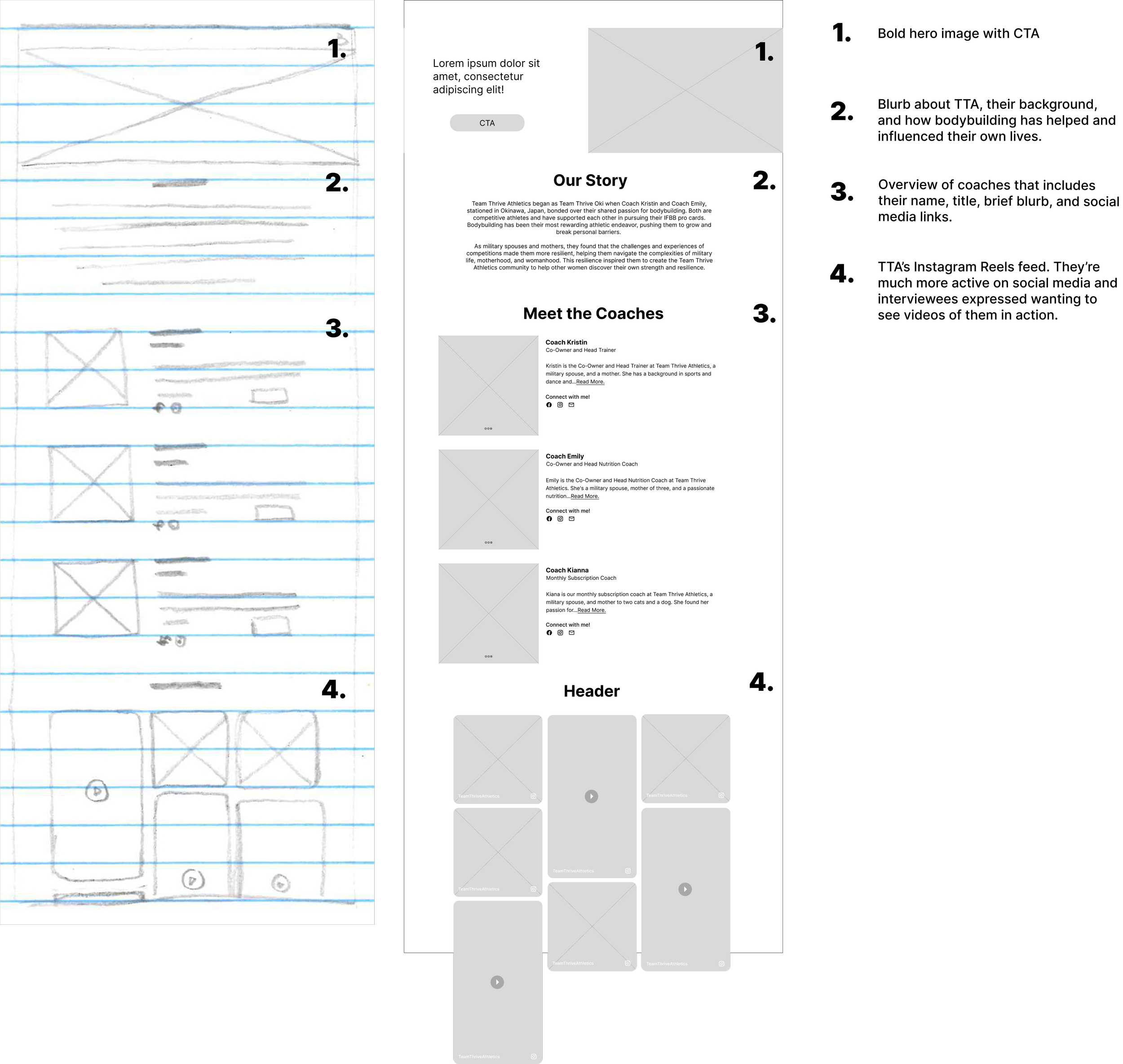
Coach Page

Consultation Sign-Up Form


Before
While there were some positive comments about TTA’s logo and color palette, “I like the color ways, the ‘80s vibe” and “The colors a cool juxtaposition between toughness and fem”, feedback during these interviews revealed that the colors were not accessible - interviewees had trouble reading the text and the logo didn’t translate well at smaller formats, “Typeface is hard to read, another treatment would be good” and “The Logo should be just the T because the “Team Thrive” is so small”.
Branding & UI


After

I chose colors that were bold, energetic, exciting, and feminine that could provide high contrast and better accessibility. The stakeholders have an affinity for triangles so I designed several logo options where triangles were the focus. After feedback from peers and the stakeholders, I landed on the above logo, which replaces the A (in TTA) with a triangle, with bold legible text underneath. This can be used a logo or just a word mark. Below are examples of other logo ideas.

Hi-fi Wireframes
Stakeholder Changes
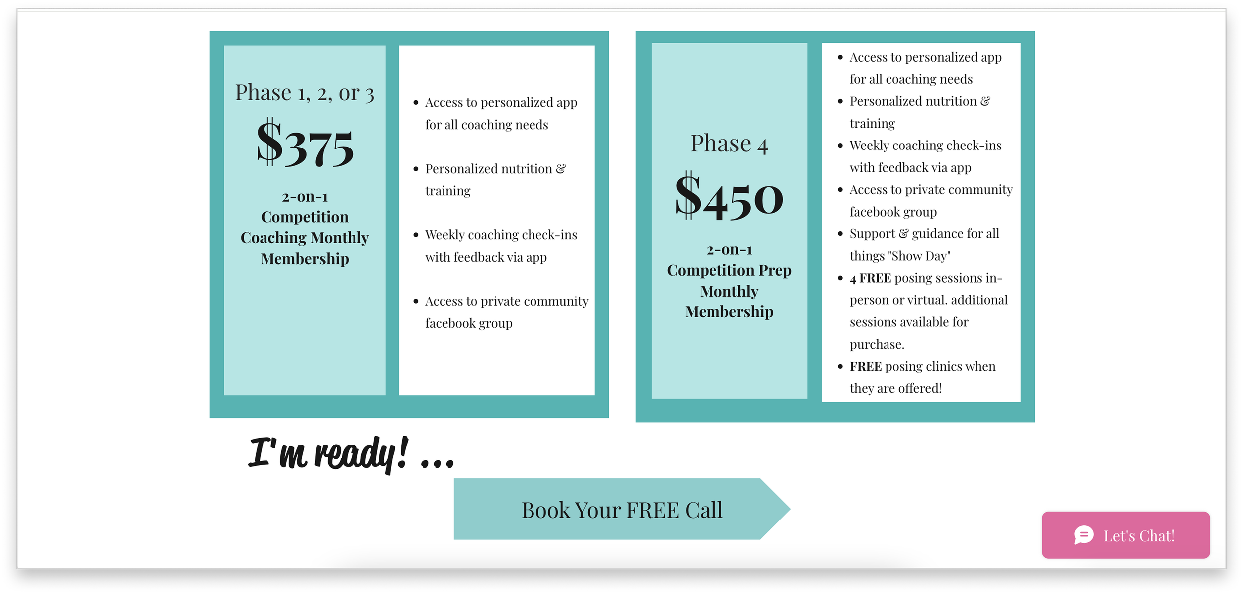
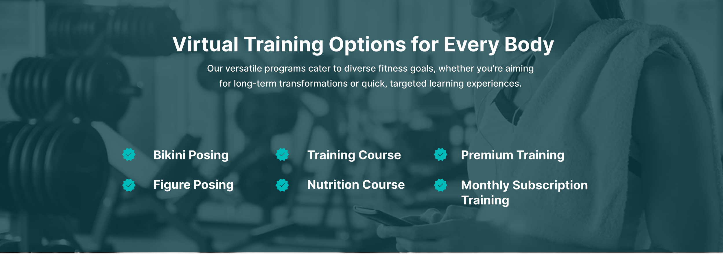
I presented high-fidelity wireframes to the stakeholders, which included the home page, services page, and individual service pages. I worked to summarize and the break down all of their services so users would have a quick, clear understanding of what they offer.
The coaches had been attending a business marketing program where they received feedback about their services. They changed three key factors of their business model:
They determined that they offer bodybuilding coaching with an option to compete, not separate programs of lifestyle and competition training.
Their ideal client is “someone who wants to be on stage" i.e. competing.
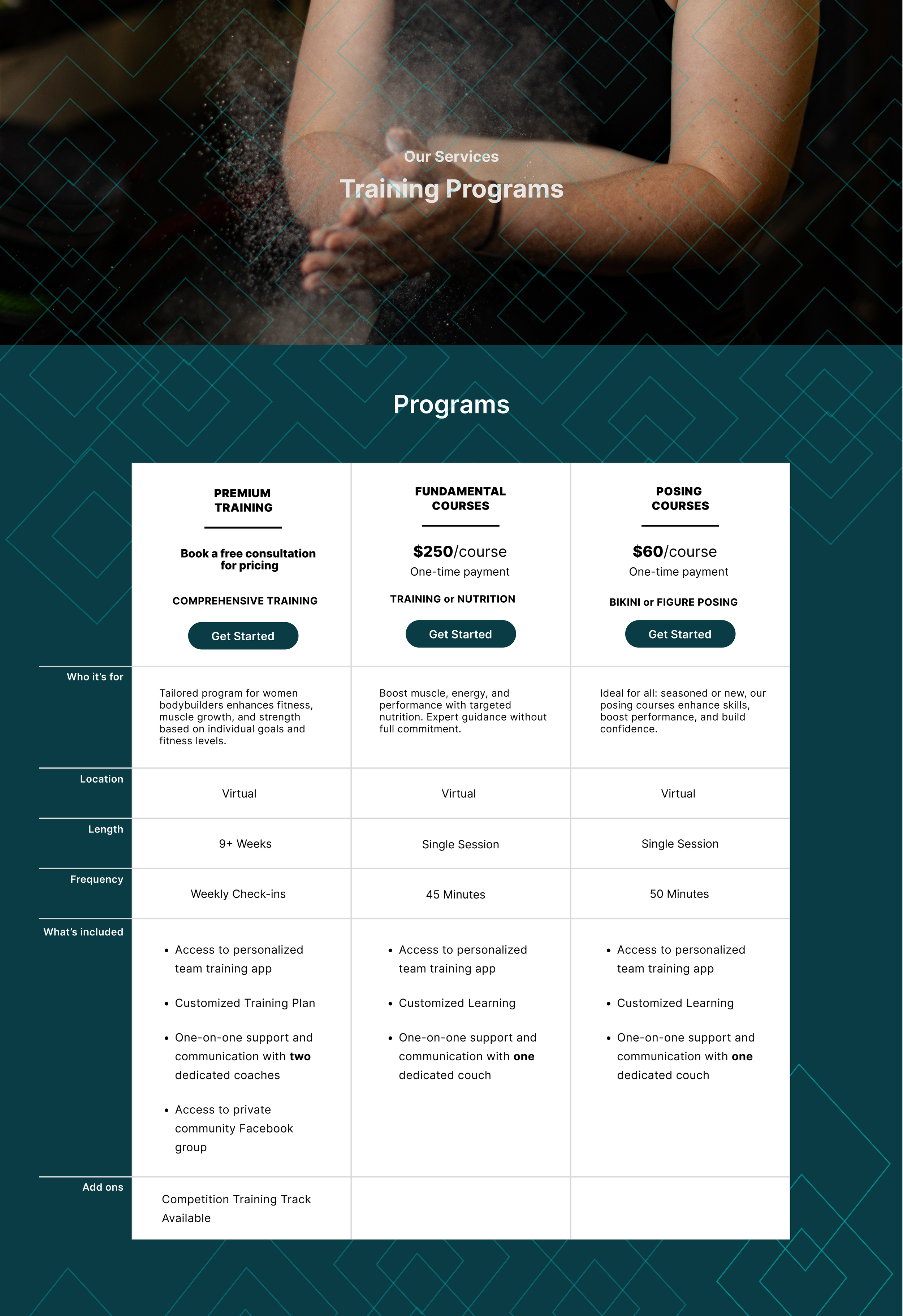
They will not put prices for the bodybuilding coaching on their website. They’re concerned that it’s scaring away leads. Instead, they will share the price during the consultation call. “We’ve had a lot of traffic to our website, but we don’t have as many leads. I think they see the price and think ‘Oh I can’t [afford] this right now’”.
Home Screen

Competition Training
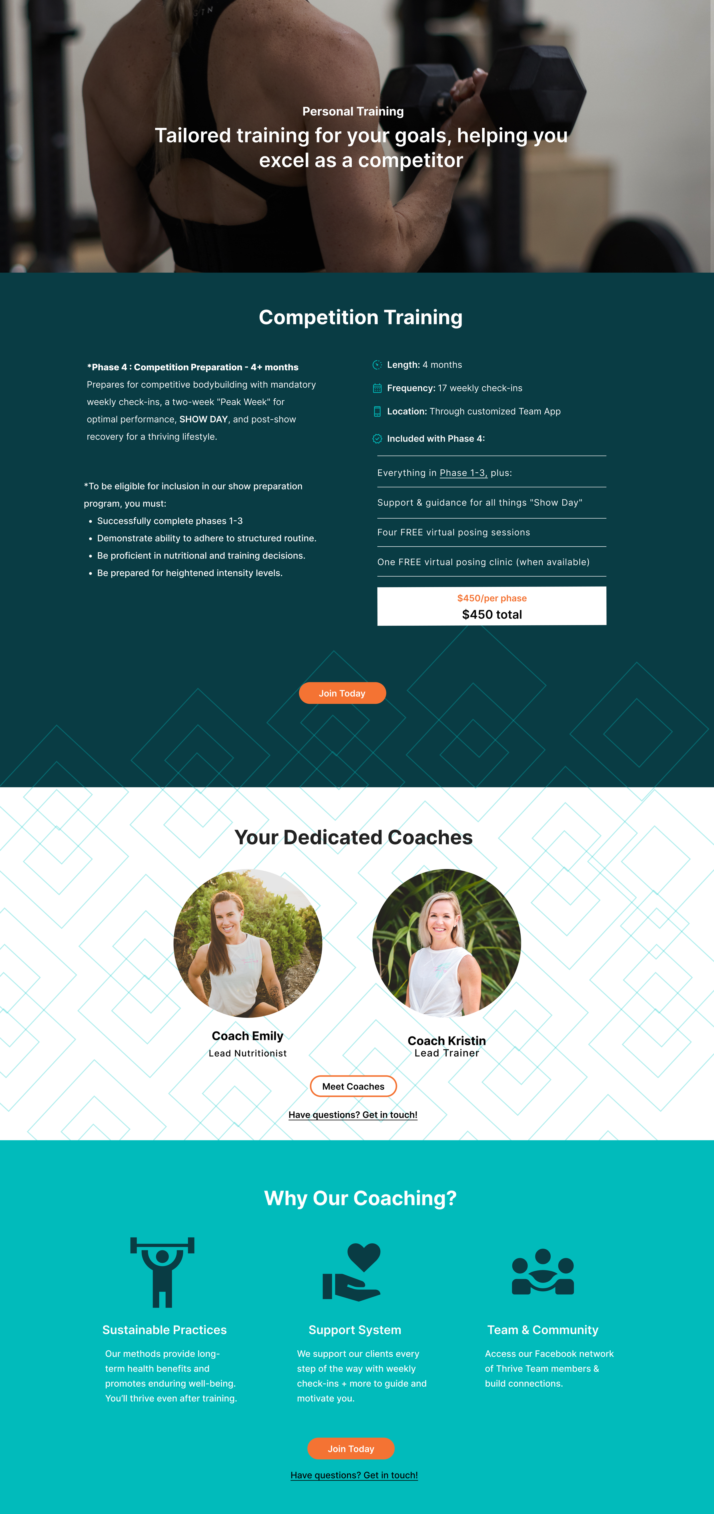
Services Page
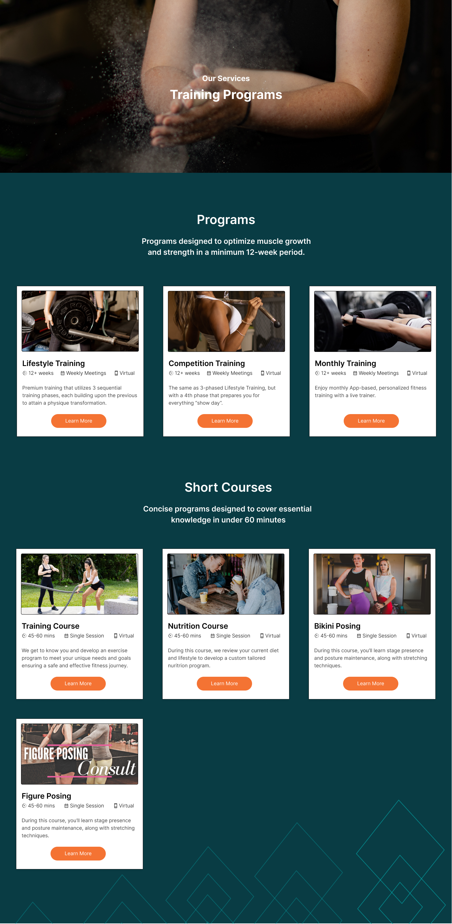
Lifestyle Training

Updated Wireframes
After receiving the stakeholders changes, I pivoted to create easy to read charts that would help users compare and contrast the services. I consolidated their services once more after they decided to no longer offer the on-demand training with a third coach.


Testing & Feedback
Usability Test Results
Interview Goals
Get observational data from the tasks.
Collect quantitative data from the scales.
Capture qualitative insights from the open-ended wrap-up.
Summary of synthesis including observations, insights, and opportunities
Task 1: Understand the Business
Task: In your own words, what does TTA do, and who do they help?
Scale Question: On a scale of 1–10, how clear was it to understand their services and approach?
Task 2: Explore Programs
Task: Find out what the main training program is and what makes it unique compared to other offerings.
Scale Question: On a scale of 1–10, how easy was it to compare the programs?
Task 3: Next Step / Conversion
Task: If you were interested, how would you take the next step to get started? (e.g., fill out a survey, book an appointment).
Scale Question: On a scale of 1–10, how easy was it to figure out the next step?
Task 4: Trust & Credibility
Task: Look at the testimonials. Do these stories make you feel more confident about TTA? Why or why not?
Scale Question: On a scale of 1–10, how credible and trustworthy did the site feel overall?
Wrap-Up Questions (Open-Ended)
What did you like most about the site?
What, if anything, felt confusing or frustrating?
If you could change one thing to make this site more helpful, what would it be?
Final
This was my first UX design project with real clients. Through several conversations and thorough research, I identified their issues.
Lessons learned:
Scope creep
While in the high-fidelity wireframing stage, the clients changed their programming, and then later, they changed their ideal client, which caused setbacks because I had to re-design their programming and messaging. Eventually, I had to inform the client that we needed to focus on major improvements first, with additional issues addressed in later phases. Thinking it would be quick, I agreed to build the website on their existing platform, Wix, which I had never used before. It included the redesign and behind the scenes connecting of products to payment.
This experience taught me to set clear expectations and prioritize needs. I plan to monitor the first phase for KPIs and, next time, will define the biggest problem, create a clear scope of work, and maintain firm boundaries.
Impact on process/skills:
This project reinforced my collaborative nature. Working with clients on their unique needs was really fulfilling. Redesigning the whole website gave me the opportunity to examine many points of the product. The clients were
Setting and measuring objectives:
WIX has tools to measure business metrics. When I first designed their site on WIX, I planned to return to the WIX analytics page to determine success based on new clients. It wasn't that simple. Moving forward, I would like to learn more about how to measure and read data.
Ultimately, I'm proud of my accomplishments, and the clients’ are happy with their new website. I am excited to see how the new site will help their business grow.